Role:
UX/UI Designer
- Research
- Visual Design
- Interaction Design
- Prototyping
Team:
- Research and Mid-Fi prototype in collaboration with Thomas Schnabel
- UX/UI Design (Visual Design, Branding, Interaction Design, Hi-Fi prototyping)- Solo project.
Timeline: 2 weeks
Tools:
Figma, Figjam, Canva, Illustrator, Photoshop, Notion, Miro, Trello
🥳 Fun People Inc.
is an educational company that offers in-person courses for adults in languages, music, yoga, and cooking. Their main attraction is workshop camps.
The school has a unique formula: they integrate classes, outdoor activities, technology, humor, games, and other cool stuff to their mission of teaching people additional skills.
How can we translate the fresh and fun spirit of Fun People courses into an app for students that cannot attend the workshop camp?
This was our approach:
🔰 Study the topic
We catch up on online education topics after Covid and got inspired by new educational tools like the Metaverse and video games.
Click here to keep reading about our research.
💡Shape the idea
We started to work on our design using tools such as competitor analysis, user persona, site map, and user flow.
Click here to read about our design process.
👥Understand the users
Through 6 interviews and 26 surveys, we got to know the users better
What surprised us a lot is that 1 in 3 prefers online training over a real deal.
Click here to discover more about our user findings.
🧪 Prototype & test
After more than 3 prototypes and their corresponding iterations, we arrived at our final version. We also created the branding and all the illustrations.
Click here to have a look at the prototypes.
The results:
🧑🤝🧑🧑🏻🤝🧑🏿 An online learning community
that inspire and give students an active role and persona.
🎉 More fun and surprising format and content
that enhances student engagement.
🧑🎓 More live classes and rewards
that make the students feel responsible for their success.
The Research
🎯 Getting Started
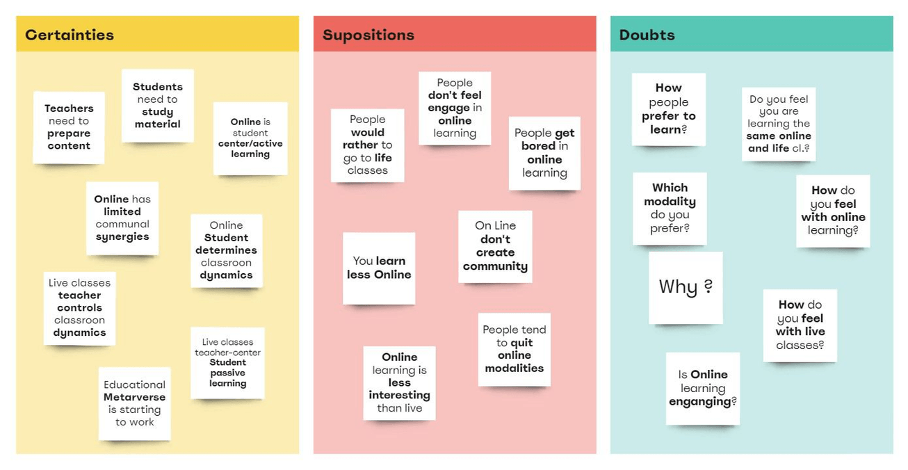
CDS MATRIX
The CDS matrix helped us frame the context of the project and understand what we already knew as a team. It clarified what we needed to research further on the topic and our users.
What is the CSD matrix?
The CSD matrix, is a technique that can help the team to define the scope of the challenge, considering:
1) What is already known (Certainties)
2) Hypotheses raised (Suppositions)
3) What is still unknown but needs to be investigated (Doubts)
DICOVERING THE TOPIC
Our first step was to search the internet and draw some conclusions from the most interesting articles and information found. Here is a sample of some of them :
Education in times of pandemic
After COVID and in a world that is moving faster and faster, e-learning education is here to stay.
Research suggests that online learning has been shown to increase retention of information, and take less time, meaning the changes coronavirus has caused might be here to stay.Click here to read the full article.
Metaverse for education
Would it be helpful and groundbreaking to use the advantages of the Metaverse in online education?
In the Metaverse, students and teachers alike can meet up in the digital space via their virtual reality headsets regardless of their real-life location. Such functionality can lead to enhanced education for those willing to seek it.Click here to read the full article.
Video games to enhance learning
We also found useful studies showing that video games could help improve the learning experience.
A study in the Journal of the Learning Sciences shows that games aligned to a curriculum can improve grades as well as long-term retention.Click here to see the video reference.
🤗 Understanding the users
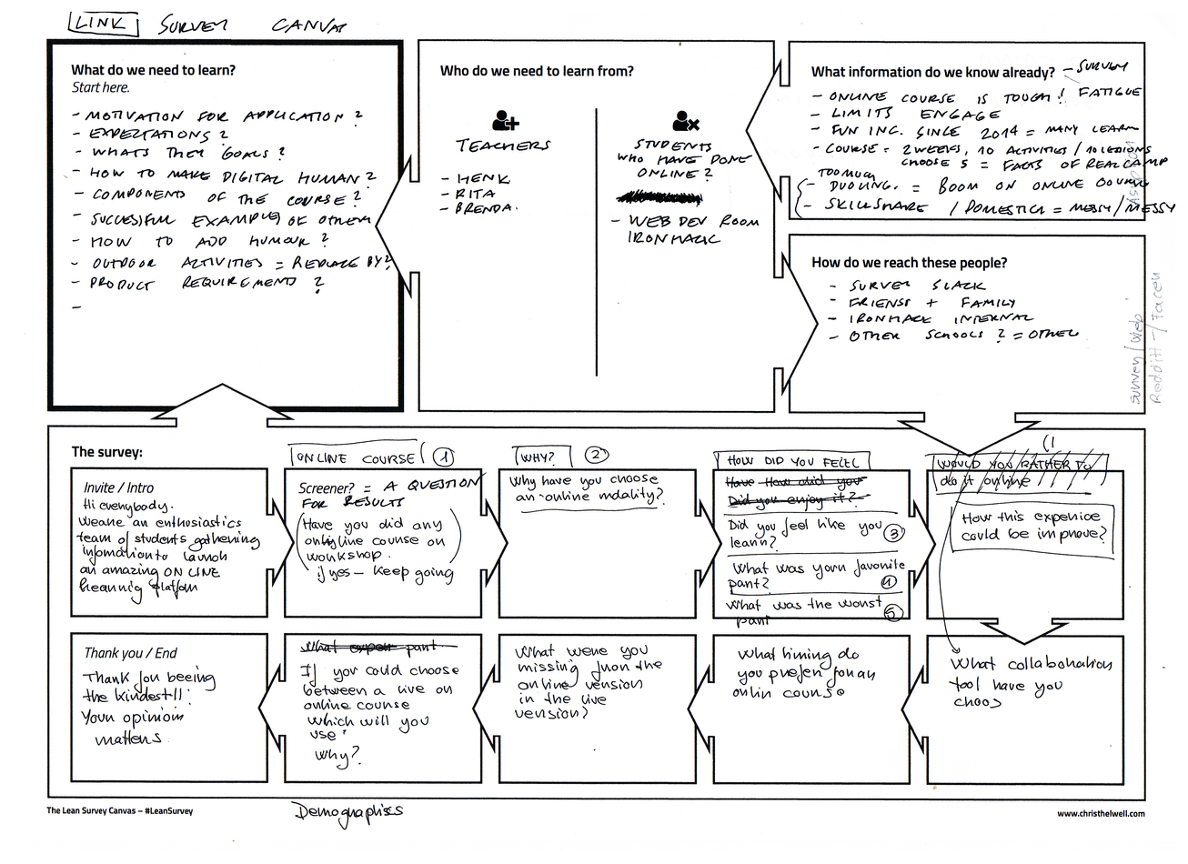
LEAN CANVAS SURVEY
The first thing we wanted to discover was our users' opinions and preferences around online or live learning.
We used the Lean Survey Canvas to quickly map out the survey as a team, aiming to get the best information from our users. This helped us understand what we should ask based on the information we wanted to get.
Click the arrow to see the Lean Canvas Survey
SURVEYS
We received 26 responses to our survey.
If you want to look at the questions asked, click here. Find below some of the data we got from our participants:
92%
have taken online courses
52%
have dropped online courses
62% prefer hybrid learning
19% prefer e-learning
19% prefer live classes
85%
are in the age group 25-35.
62%
rate their online learning experience with a 4 out of 5
77%
prefer the time flexibility of online courses
39% are fully satisfied with their online experience.
46% are satisfied but expected more from the experience.
Among the personal comments received, the majority of respondents agreed on the following about online learning:
They believe that more live classes and more interactive content would help to improve their experience.

They value the possibility of studying from home, the self-learning pace, and the accessibility of the contents.
They miss the lack of interactivity with their classmates and teachers.

INTERVIEWS
In addition to the 26 surveys, we conducted 6 interviews.
We were fortunate that our interviewees were not only teachers but also students, so we had double material for each of them. See below some of the results:
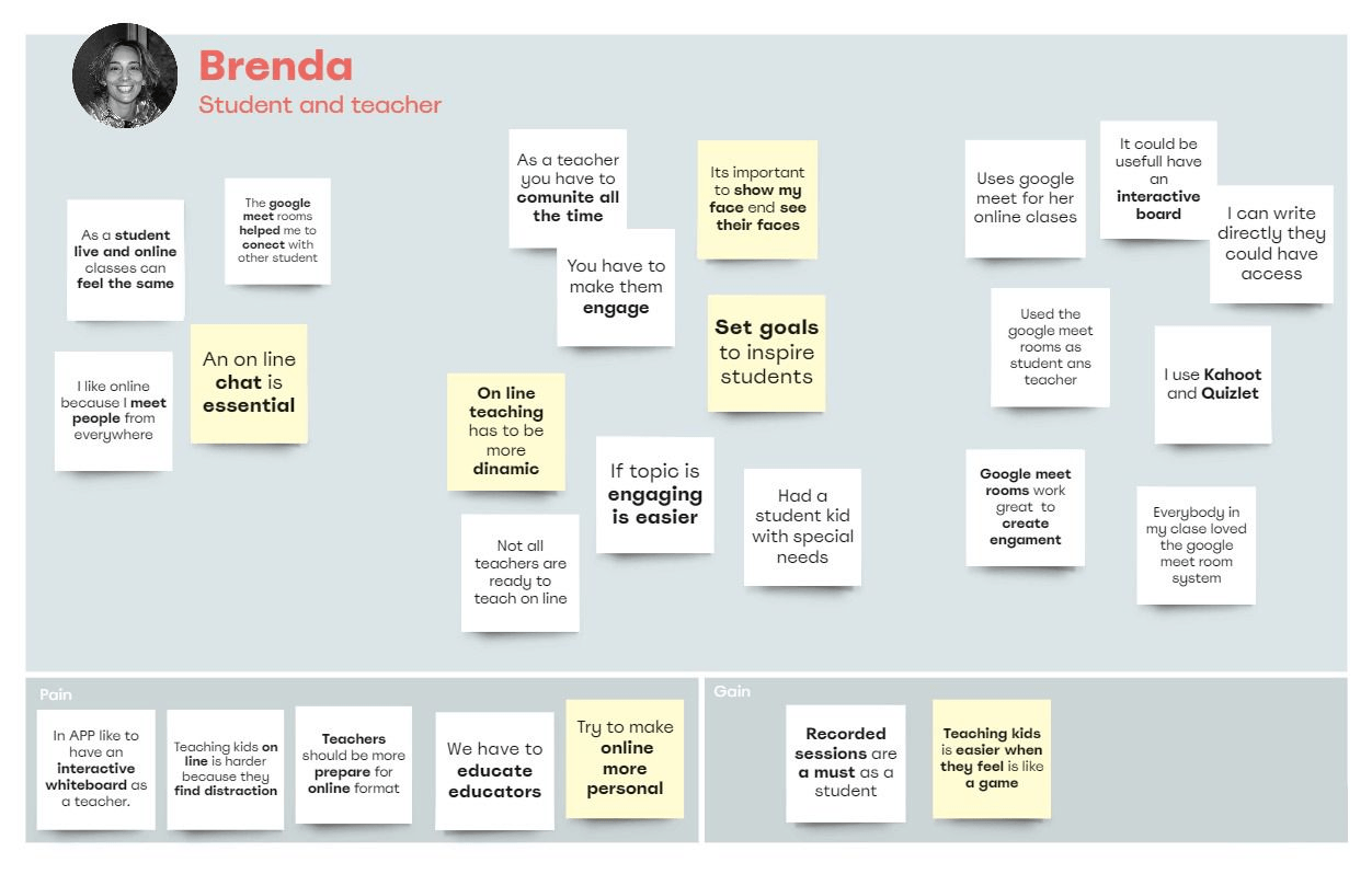

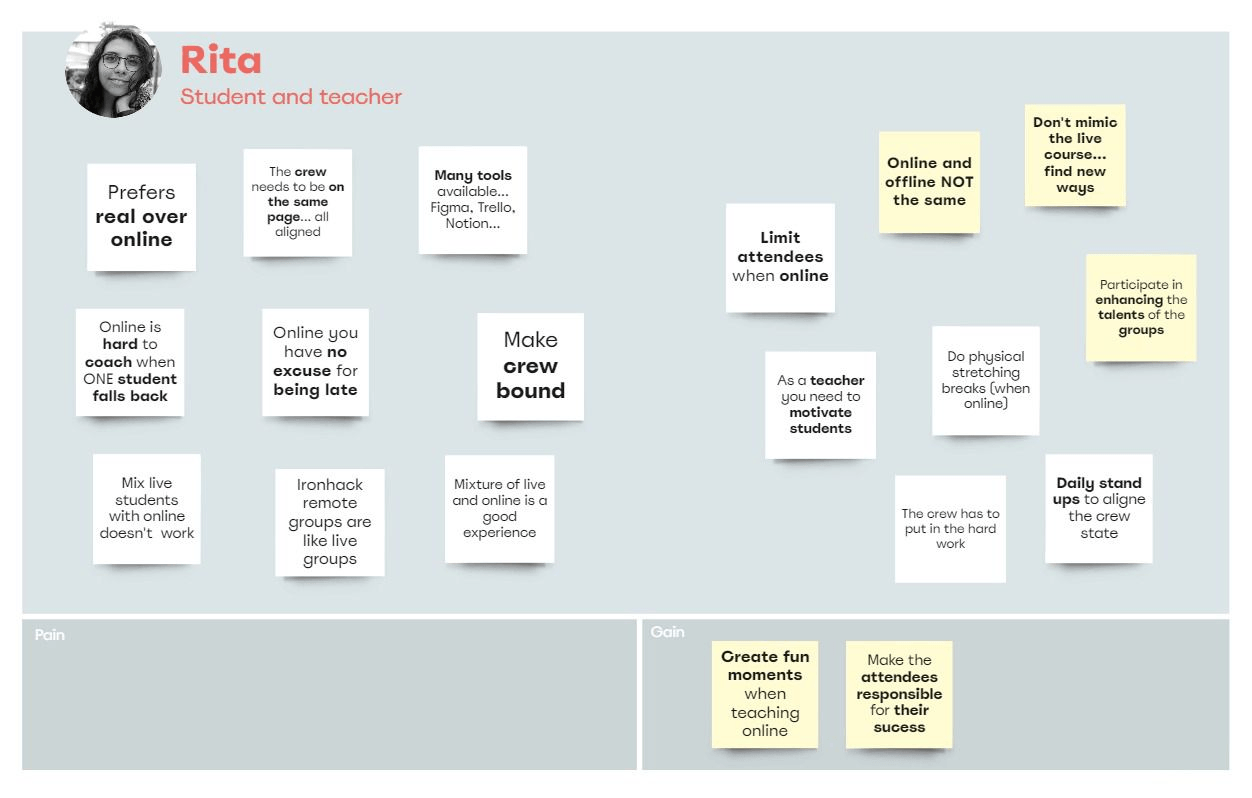
“Don’t try to cut and paste from the in-person course. You need to re-think and redesign a digital experience from scratch”
Rita -student and teacher-
Click the arrow to see Rita´s interview notes.
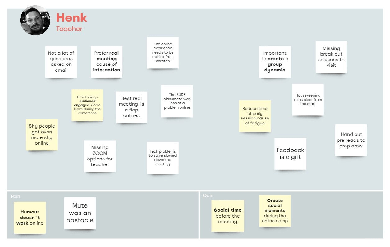
“Let the audience participate and let the team collaborate with the course and the teacher. Engagement is key to the success of the courses”
Henk -teacher-

Click the arrow to see Henk´s interview notes.

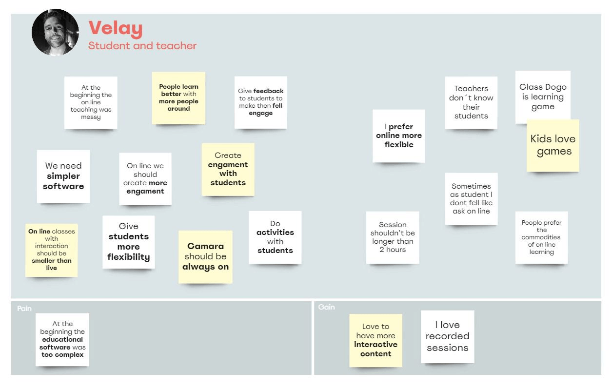
“Give your audience tools to express themselves and their emotions during the course”
Velay -student and teacher-
Click the arrow to see Velay´s interview notes.
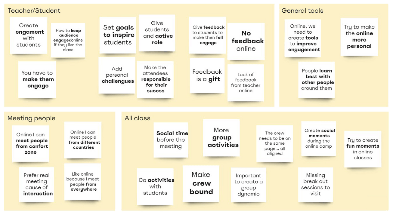
AFFINITY DIAGRAM & PAIN POINTS
We had a lot of data and needed to group it and make sense of it. We found no better tool than the affinity diagram. You can click here for its full version.
Among all the information extracted from interviews and surveys, we found three more relevant and repeated topics :
1️⃣ Connections and relationships
with teachers and other students were essential for the users.
2️⃣ The need for more interactive and visual content.

3️⃣ The importance of flexible class timing.

🏇 Our Competitors
Funverse seeks to fill the market niche between platforms with quality content and easy accessibility and those looking for a more playful and engaging experience, presenting as a middle ground between the two.
We looked at our main competitors to see where we could position ourselves in the market. Our research showed that Coursera and Udemy are the most popular platforms among respondents, but we identified a few more: FutureLearn, SkillShare, SkillCrush, EDX, Domestika.
In our interviews, some teachers mentioned others like ClassDojo, Kahoot! or Quizlet, which they started to use since the pandemic, seeking to engage their students more during their online sessions.
Shaping the idea
🤔 First conclusions
How might we get our students to enjoy and have fun learning while interacting?
We started brainstorming about the look and feel of a new online learning experience. This process was a mix of discussion and sketching of concepts and screens of the potential mobile application. With all our energy as a team, we decided that these 3 points had to be a must:
Connection and Engagement
Create a space where students and teachers can interact. Inspire and give students an active role and persona.

Format and Content
The class content should be entertaining, surprising, and fun. A mix of on-camera and recorded content would give us a balance between time flexibility and more interaction within the class.
Make it rewarding
Everyone likes to win. The feeling of victory and the challenge achieved would give our students the motivation to continue with their courses.

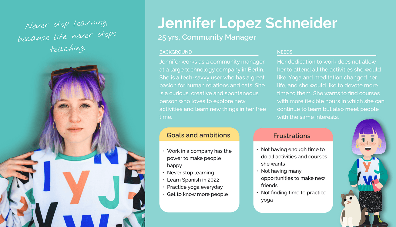
👧 Our persona
Our project focuses on young, tech-savvy people who are eager to learn.
Initially, we thought of creating two personas: one for the student and one for the teacher. As the number of students will always be much higher than the number of teachers, we decided to center on students as our primary persona given the higher time constraints. Thus, Jenifer came into the picture.
🚧 Building the Architecture
SITE MAP
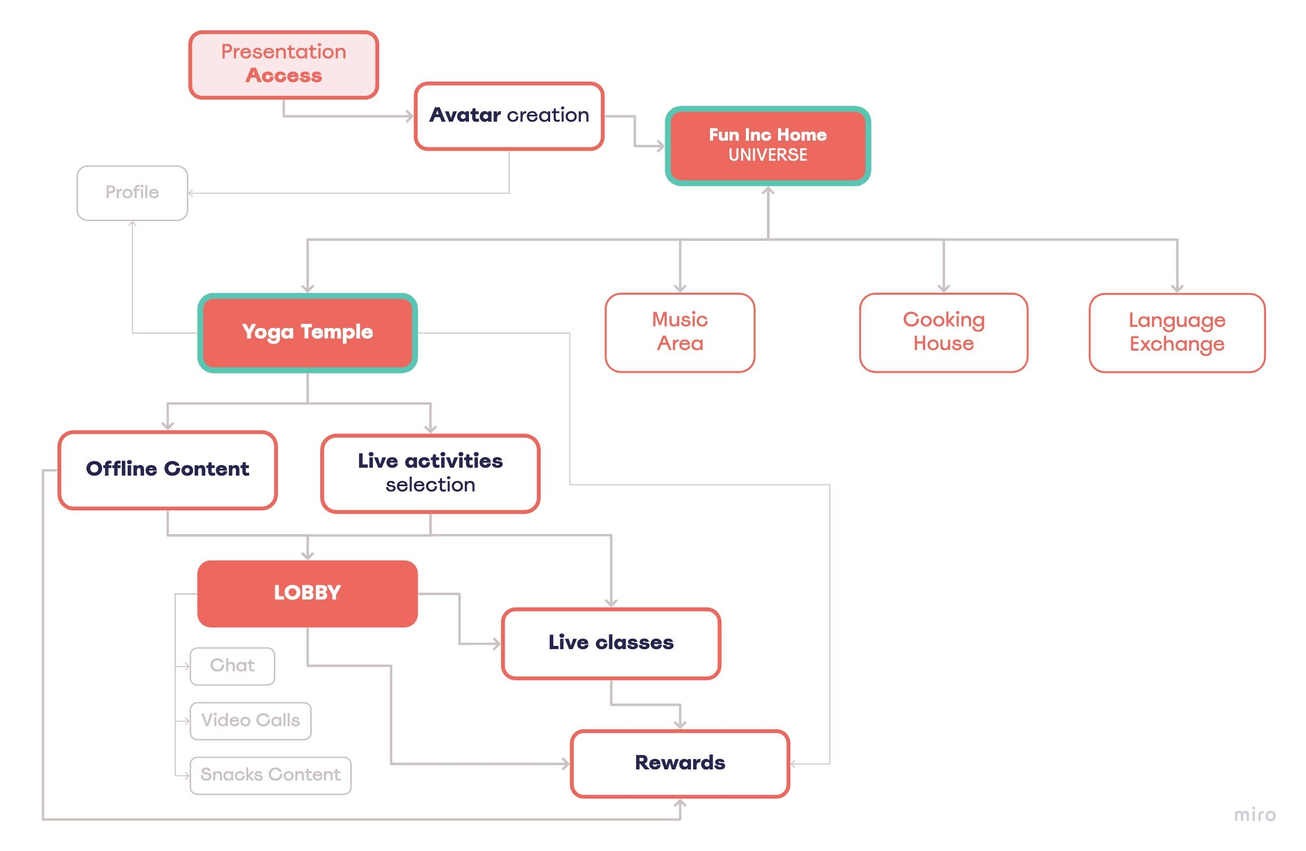
People chose Fun people Inc. for their classes format and teaching system, and that's why we wanted to represent their entire learning Universe.
We aimed to create a class format that could adapt to all the topics they offer. But given the time constraints, we would take yoga as a starting point.
Within our Yoga Area, we have decided that we will have:
Offline Content
that students can study on a flexible schedule.
Live Classes
from which users could choose different types and times. This helps create more connections with the crew (a camera is a must)
Lobby Space
a place in the app where students could meet each other, and also keep learning and find things related to their classes.
Rewards
At the end of each lesson, students will receive a reward. Making the them feel and see their progress. Inspiring them.
USER FLOW
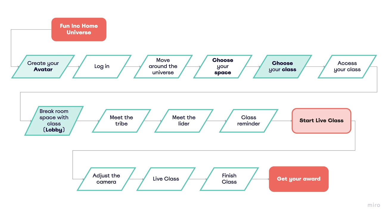
For this scrum cycle, we focus on the live classes and the development of the Lobby, a space for student interaction.
We wanted to show the user experience since they enter the Fun People Inc Universe and create their avatar and profile until they get their rewards at the end of a class.
The Design Process
👩🏻🔬 Early Prototypes and Iterations
It was time to translate all the information collected into a physical product. We got down to work and designed the first screens focusing on the following parts:
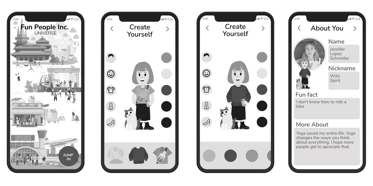
ACCESSING THE UNIVERSE
Introducing the Fun People universe.
We decided that this world would consist of the Yoga Temple (for the yoga classes), the Music Area (for the music classes), the Cooking House (for the cooking classes), and the Airport Language Exchange (for the language classes).
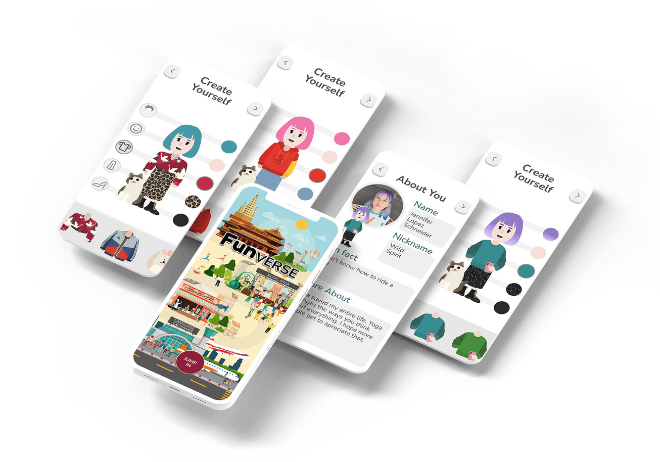
Avatar creation
Reinforce the link between the avatar and the real person behind it. May one be a reflection of the other.
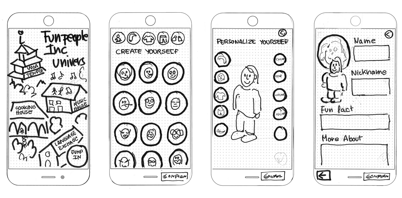
Iterations after testing:
- Simplify the avatar creation process
- Adjusting, rethinking, and repositioning all the buttons.
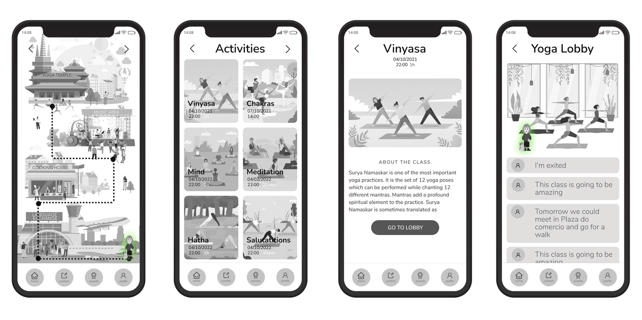
THE CONTENT AND THE LOBBY
Access to the Yoga Temple.
Discovery of their different rooms and spaces. These would correspond to the live classes available with their corresponding schedules.
Class page
Details and content of the selected class.
Introducing the Lobby
Virtual space where you connect with other students and teachers.
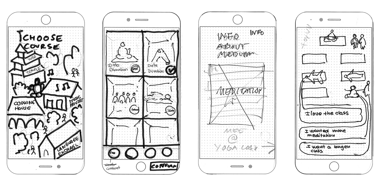
Iterations after testing:
- We did several iterations for the classrooms (yoga rooms) and the Lobby screens. Users were confused about their order and relation in the flow.
- Choose your class
- View the content
- While waiting for the class to start or viewing the content offline, you can access the lobby to interact with your classmates.
We solve it as follows:
- The users claim more accessible content so we added home, content, award, and profile buttons. This way, the user had direct access to all while using the app.
LIVE CLASSES
Live class and camera adjustment
See the other students will be essential in for bonding.
Getting Awards and class progression,
We want to keep the user motivated.
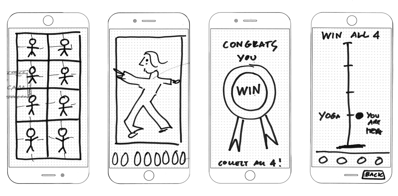
Iterations after testing:
- During the live classes, only the teacher would be visible.
Originally we had planned to put thumbnails of the students, but as it is an app, we needed to use the whole screen for a clearer view.
- The button bar reappears in the rewards and class progress screens.
Users commented that they like it to be available on as many screens as possible.
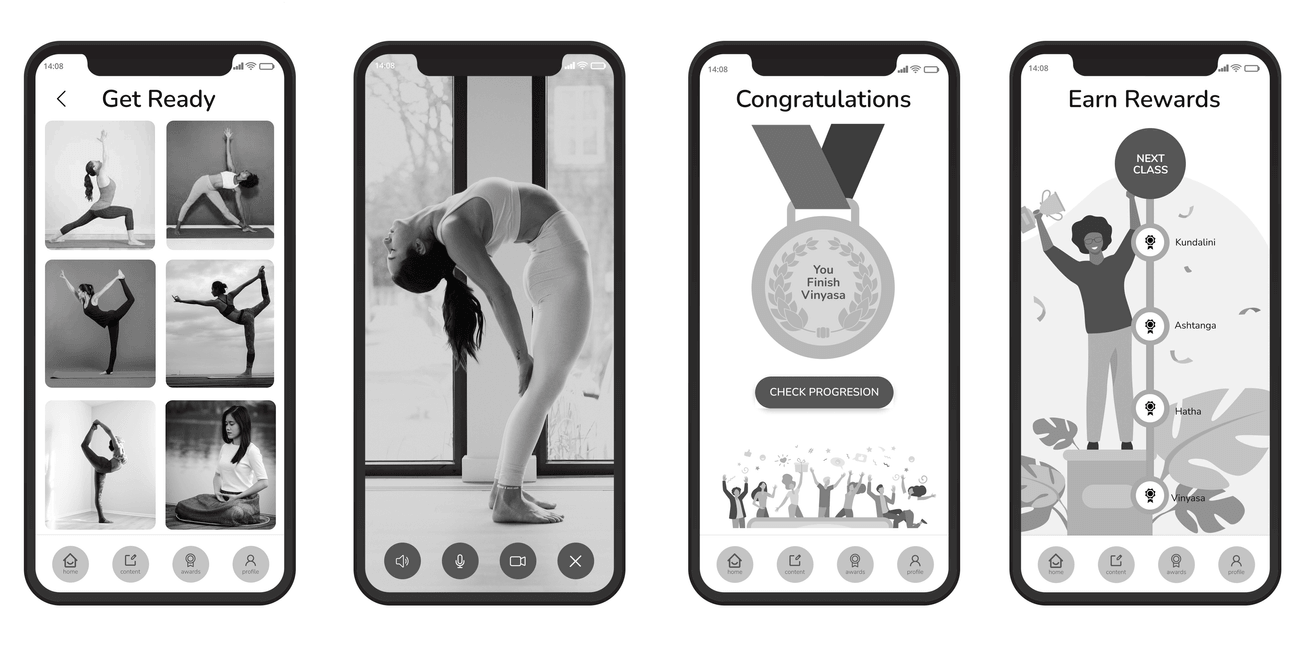
🏗️ Mid-Fi Prototype
It was a big challenge to make the game animations we imagined in our Lo-Fi Prototype. Using a lot of free vector illustrations from Freepik we composed our world and characters. At this stage, we didn't think about the colors and shape of the brand, but we tried out some fonts that would fit the playful spirit of our application.
It was a challenge for us to achieve that playful look, while still learning and dealing with animations that were very new to us at this point.
The Final Product
In the second part of the project, we faced the challenge of refining the prototype and developing a feature. This time we had to work alone. We also had to create a brand and name the product (this is where Funverse comes in).
📸 Visual Competitive Analysis
To create the new image and brand, I looked at some of the competitors. Not all of them were direct competitors, I also used games as a reference. They helped to find the right looks for the different parts of the app.
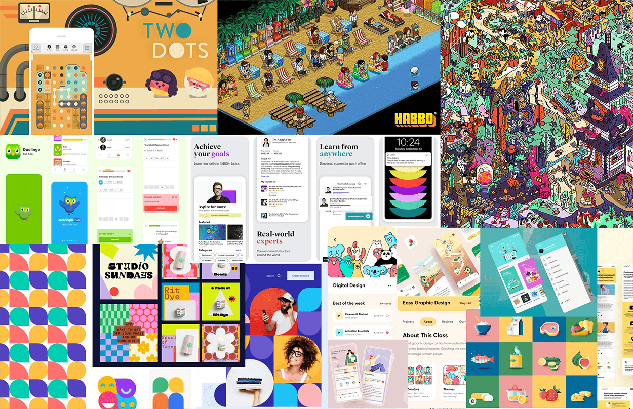
The illustrations and color palettes of the puzzle game Two Dots were a great inspiration to create the lobby, a new feature developed in this second scrum.
Habbo is an online community that became one of the biggest success stories in social gaming. It was a great reference to create the virtual community of the lobby for the interaction between our students.

Duolingo manages to combine learning and games in a fun and playful way. It makes you discover new languages little by little and with rewards.
Udemy is exclusively focused on teaching but shows its content in an entertaining way using animations and drawings.

🎨 The Brand & The Illustrations
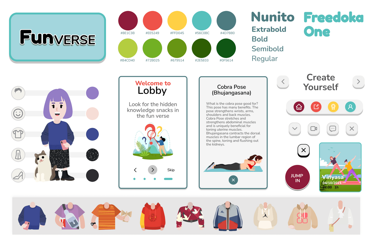
The new image aims to be playful, bright, lively, and positive. To create an energetic vibe where your students feel full of life and open to learning.
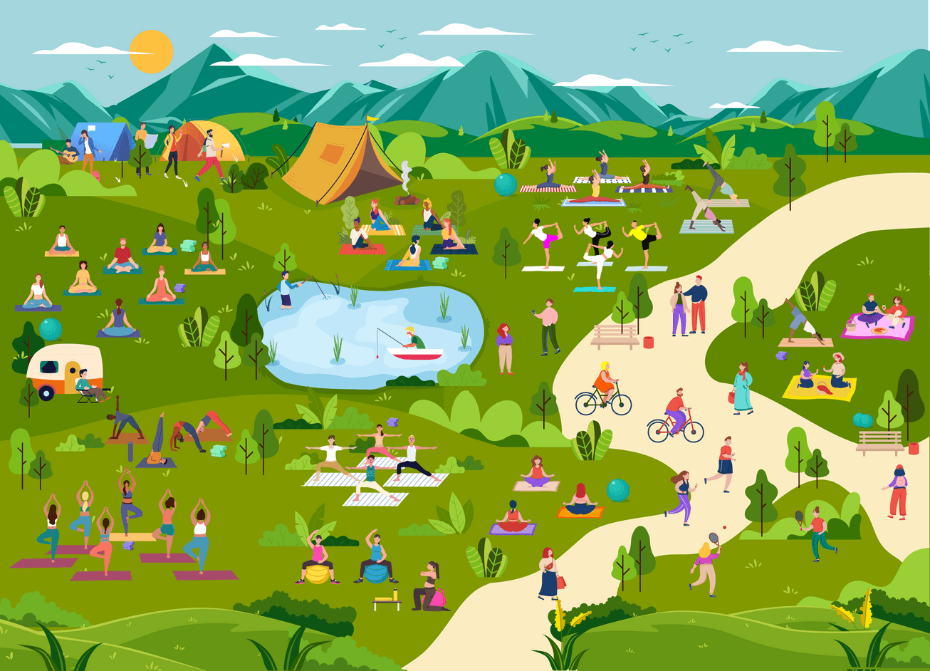
It was a challenge to recreate this spirit of playfulness and small virtual worlds for the app. The Funverse Universe, The yoga lobby, and the cover illustrations are collages composed of several vector illustrations from Freepik. I matched them together and changed the colors to match the brand.


🆕 New Feature: The Lobby
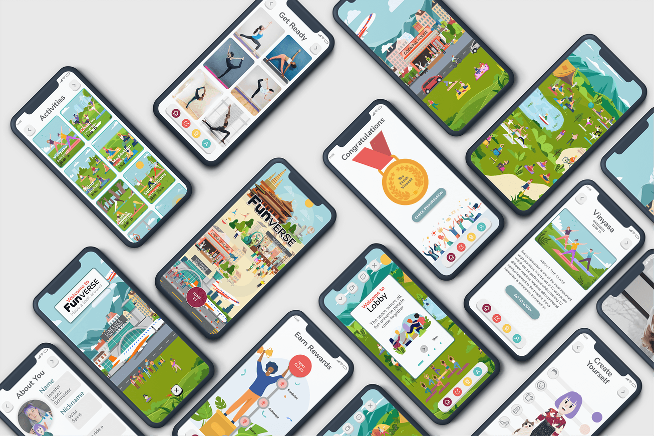
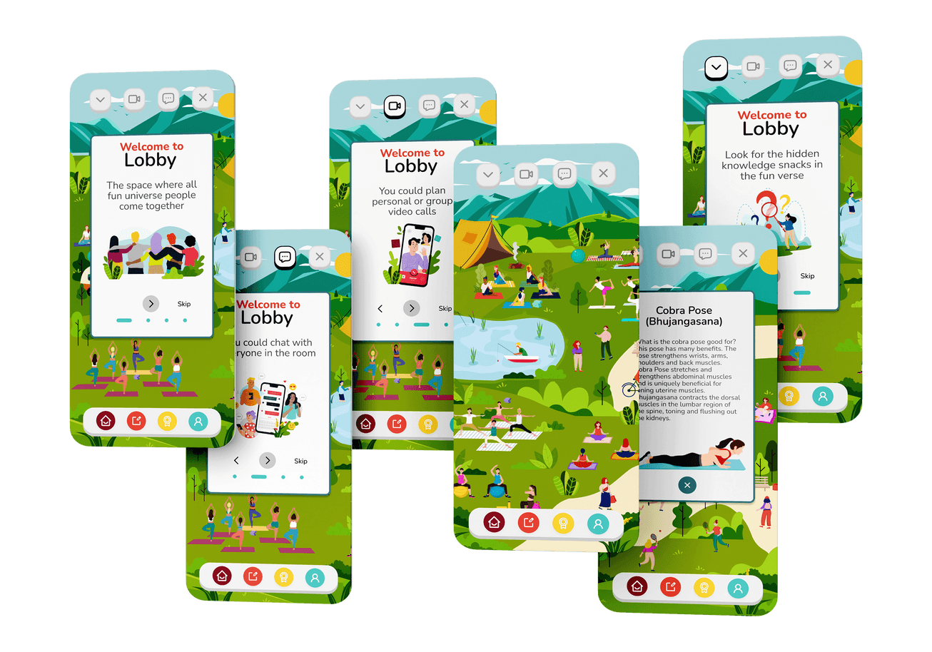
The lobby will be a space where all Funverse People come together.
They could chat with everyone in the room, they could plan personal or group video calls, and you could look for hidden knowledge snacks.
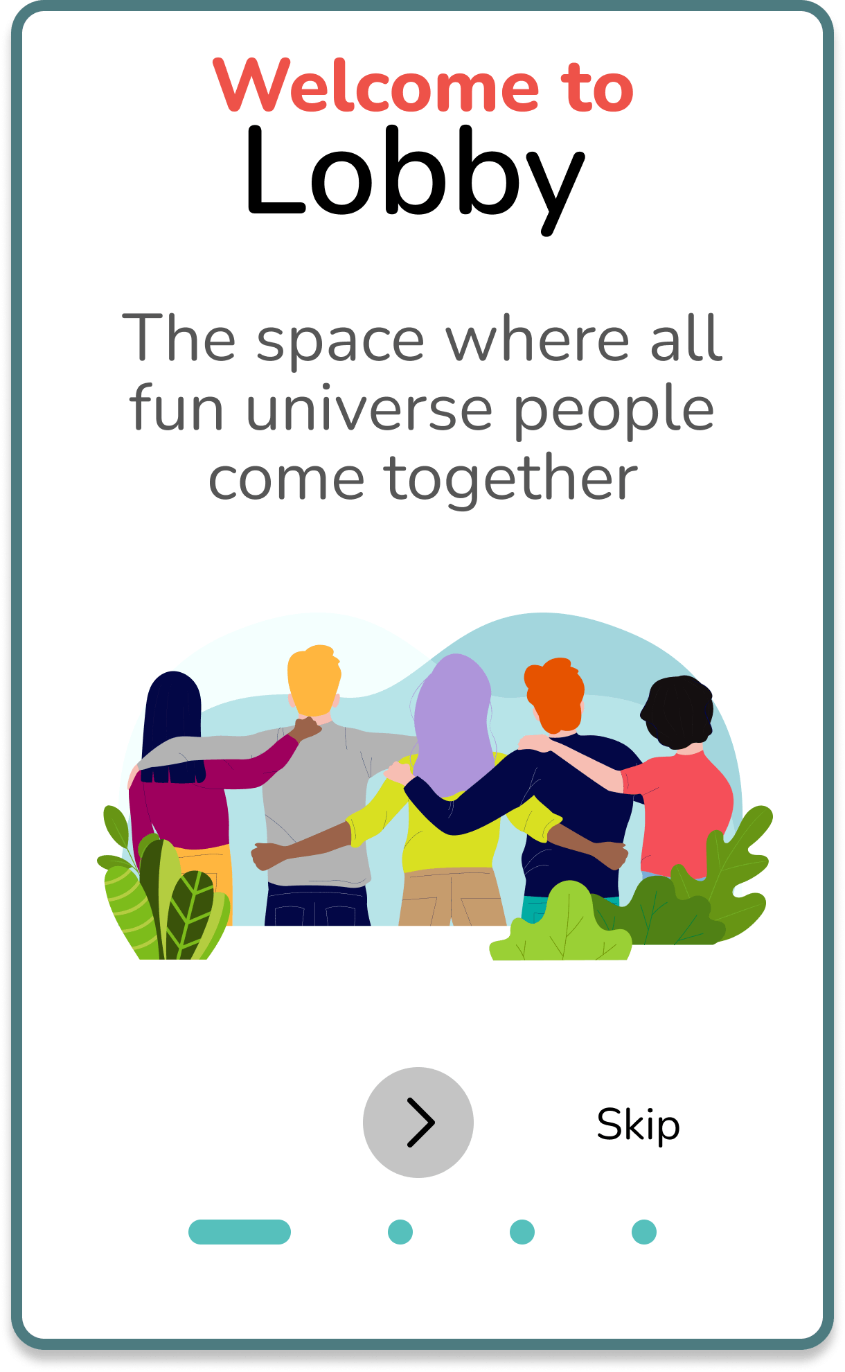
In this last iteration, the lobby position changed again to fit more naturally into the flow. It is now a space you access once you enter the Yoga Temple of Funverse.
These two worlds behave like the home to which the user returns after doing their class, reading content, or seeing their achievements.
It is the space where everything meets.
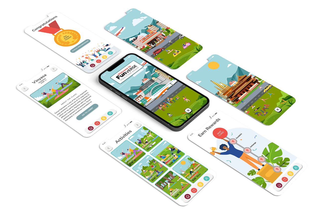
🏁 Final Screens
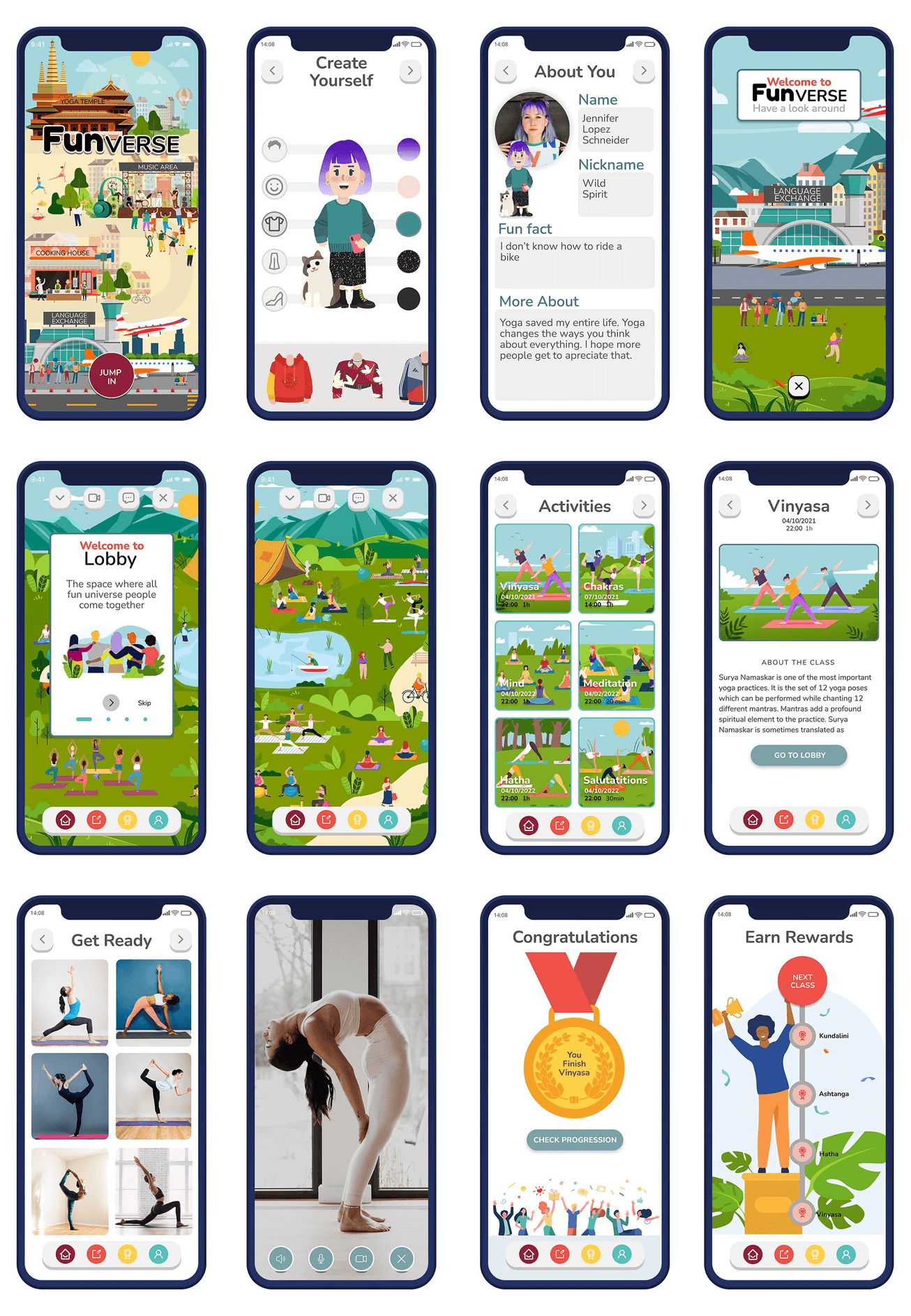
📽️ Video
Conclusions
🎓Learnings
You can't have good UX without having a solid UI
The biggest learning of this project was understanding the importance of the UI of an app. A good user experience should always be accompanied and reinforced by a well-designed interface. The one feeds and strengthens the other. At Funverse, the playful and immersive UX we seek would not be possible without UI that strengthens and facilitates this experience.
UI is time-consuming and error-prone because it involves design.
Not just visual or sound design, but more importantly interaction design. I realized that UI decisions, like the brand or the illustrations of Funverse, require a lot of time and research. We have to train our eyes to be more agile in this field.
The power of teamwork
I recognize once again the richness of teamwork. Although it is sometimes difficult to reach agreements, the diversity of ideas always takes the project further.
🚶🏻♀️Next Steps
Complete development of the Funverse universe
I would like to keep working on the design and integration of the Funverse Universe and its four different spaces (Yoga Temple, Music Area, Cooking House, and Language Exchange) into the app. I like to be able to develop them further into a more complex and developed world. I want all the functions of the app to revolve around this. I think this would enhance the experience and all feature integration.
More illustrations and animations
That would require more work on illustration and more sophisticated animations. It would be almost like the process of creating a video game. For which we would have to keep testing and iterating like crazy.
