Role:
UX/UI Designer
- Research
- Visual Design
- Interaction Design
- Prototyping
Team:
- Research in collaboration with Giampiero Fiorino.
- UX/UI Design (Visual Design, Branding, Interaction Design, prototyping)- Solo project.
Timeline:
2 weeks
Tools:
Figma, Figjam, Canva, Indesign, Illustrator, Notion, Miro.
👩🏻💻 Women4Cyber
is a non-profit European private foundation to promote, encourage and support the participation of women in the field of cybersecurity.
Their Portugueses chapter launched in October 2021. Although they currently have a website, they are looking to create a new one that will better represent them and help them convey their message and initiatives.
Their current website has low usability, poor conversions, and a lack of all necessary functions. These are the challenges presented to us in the briefing:
- A new intuitive, easy to navigate, and gender-neutral design.
- Organize content to convey a clear message of Women4Cyber’s mission.
- Convert visitors into new contacts (higher conversions of students, career changers, volunteers, partnerships, followers, etc.)
- Relevant sections: blog social media, partnerships, helpful links, events.
- The tone should be inspirational and informative.
This was the approach:
💻 The cybersecurity context
By studying various reports we have discovered that there is a great need for security professionals today. Only 24% of them are women: what is the reason for this huge gender gap?
Click here to keep reading about our research.
✍️ Interviews and surveys
We found that 90% of women between 20 and 40 still feel insecure when they decide to study technical careers. 93% of them have not received support and encouragement to choose such careers.
Click here to keep reading about the interviews and surveys.
🤸🏻♀️ Prototyping and organizing
I focused on creating a new and robust skeleton for the site. I aimed for simplicity and usability while creating a more youthful and accessible brand.
Click here to keep reading about the design process.
📝 Usability Test
The current site gave us the basis of what wasn't working for users and what we needed to improve. We needed to tell Women4Cyber story better and a total reorganisation of its content.
Click here to keep reading about the Usability Test.
📊 Competitive analysis and priotarization
The study of other similar organizations was fundamental to understanding how to reorganize the new website. How can Women4cyber distinguish itself from others?
Time constraints meant that learning to prioritize was key to the project.
Click here to keep reading about Competitive Analysis & here for Priotarization.
The results:
📜 Scrollytelling explaining W4C mission
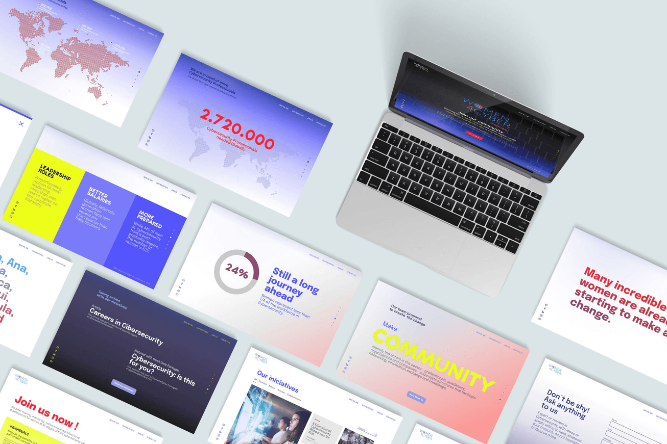
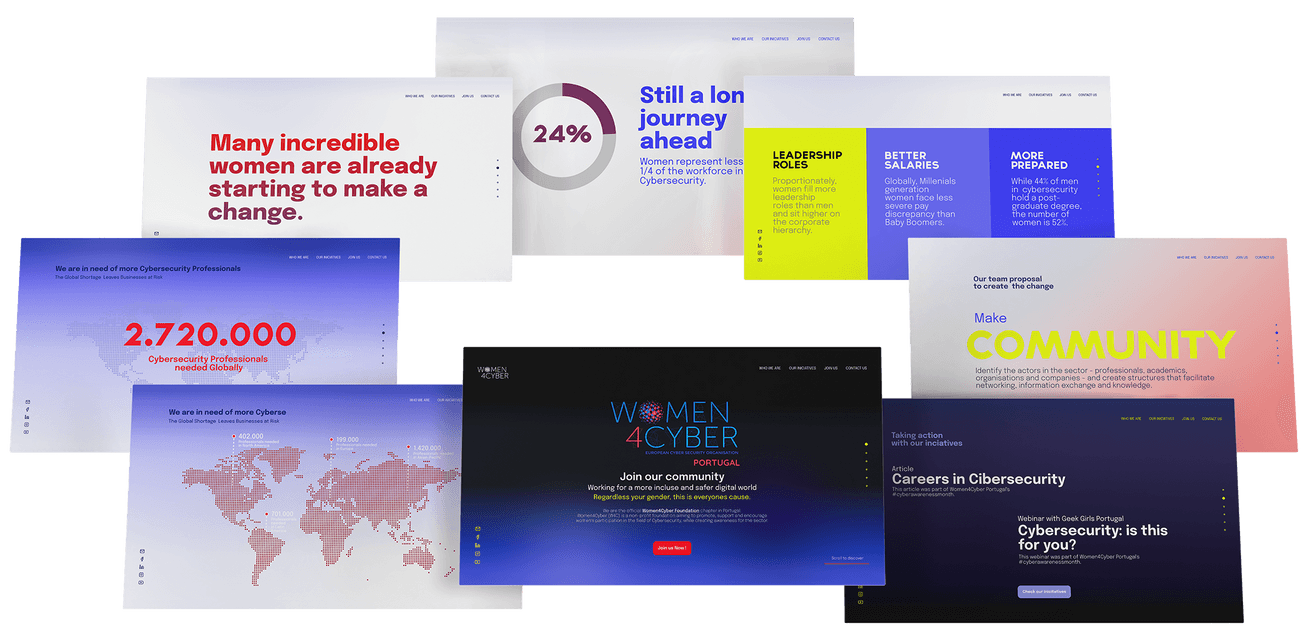
Design of an opening Scrollytelling explaining Women4Cyber's mission in a simple, visually distinctive, and more appealing way.
The scrollytelling connects the W4C mission to all other parts of the website.
👩🎨 Website Re-branding
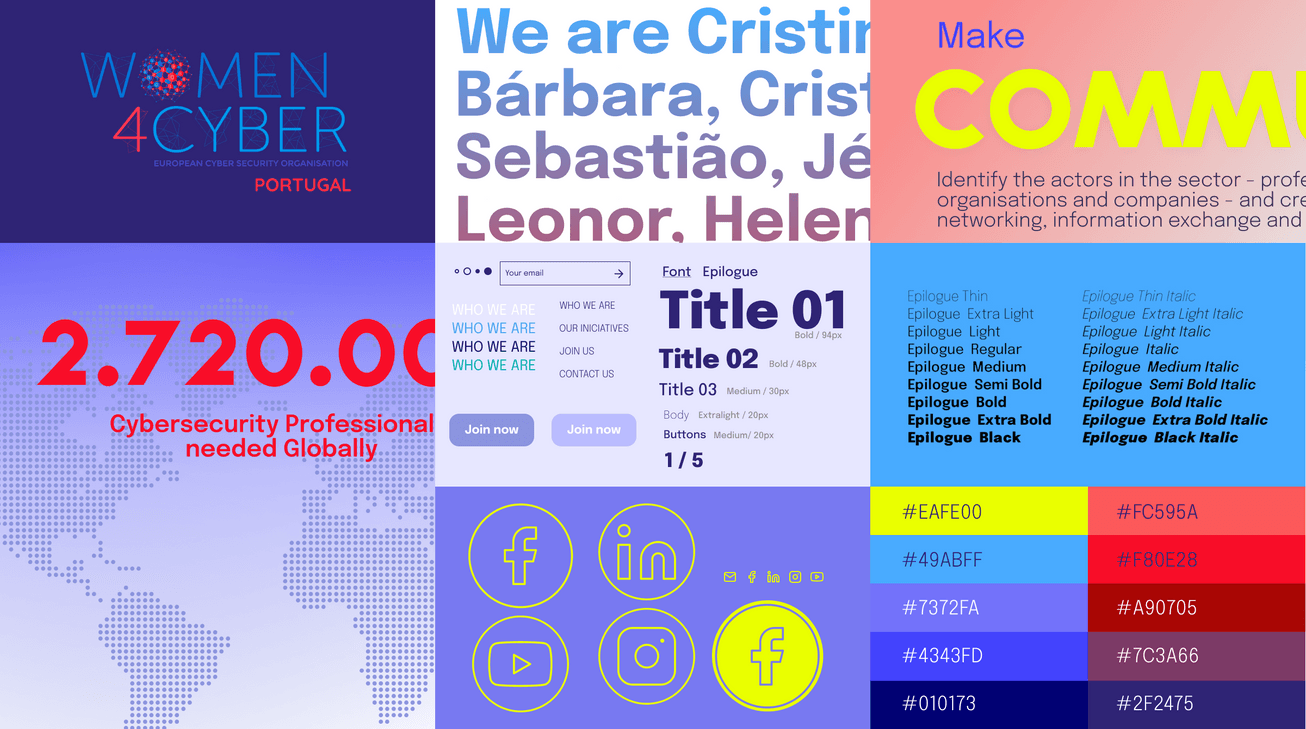
Creating a new, younger and more professional, gender-neutral image based on the European Woman4Cyber logo.
🗄️ Structure and content reorganization
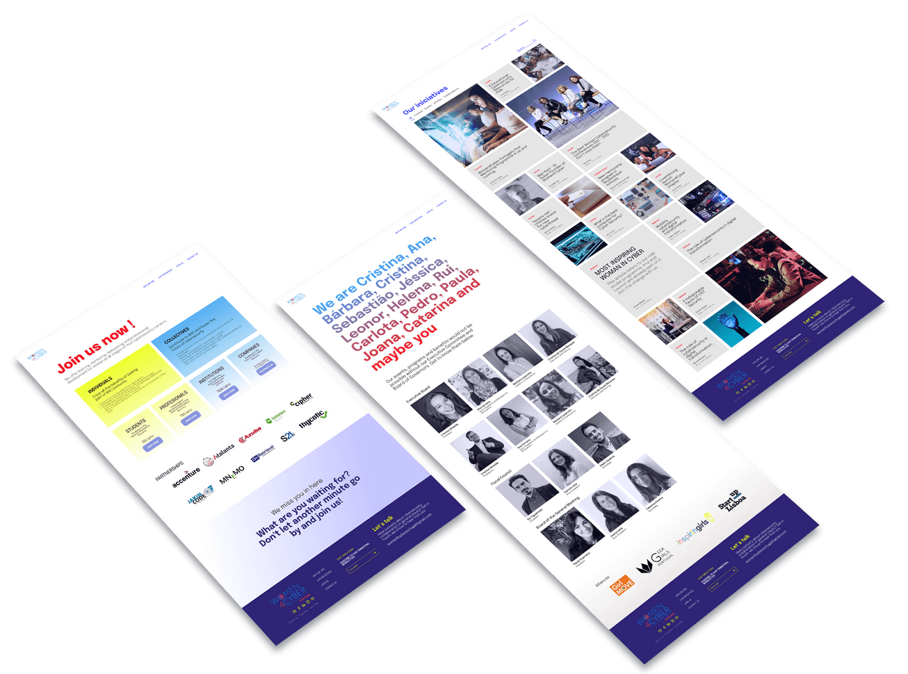
Creation of new pages and reconstruction of the site structure to improve usability.
The Research
🤖 The cybersecurity context
We started the project with an interview with our clients. After studying the briefing, we wanted to know their goals and concerns.
They convey the need for cybersecurity with enthusiasm and passion and want to help women and girls make their way in this field. They provided us with the regulations and statutes of the association in Portugal along with two reports by (ISC)² which I mention below:
These reports showed the reality of the need for cybersecurity professionals and the low percentage of women currently in the field.
They showed tested numbers and graphics that Women4Cyber wanted to use to get their message across.
The survey conducted for this report collected data from 3,790 security professionals at all levels.
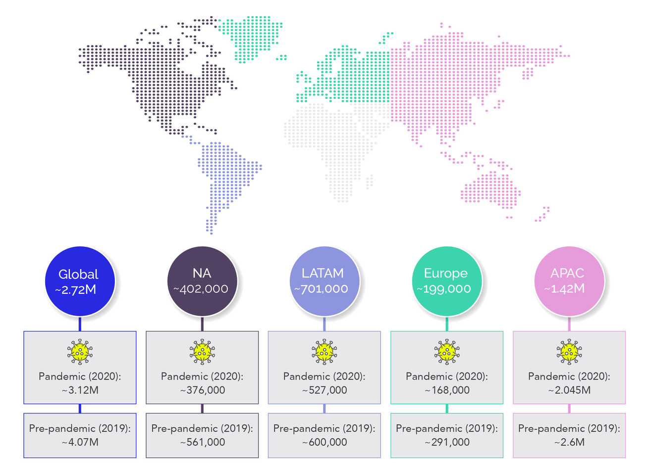
These are some of the findings we drew from our client's interview and research:
For W4C Portugal was essential to be able to create awareness about the need for cybersecurity professionals (2,720.000) and that more women are needed to fill this gap.
Only 24% of the professionals interviewed for the (ISC)² were women, and that is why we must work to close the gender gap.
Women working in cybersecurity today fill proportionately more leadership roles. They also have improved their salaries compared to previous generations, and are much better educated than men.
W4C Statutes and Regulations are not included in the current website. These detailed the association joining process, the fees, the membership types, and the access questionnaire. All of them should be present on the new website.
🧪 Testing the existing site
We started from an existing site, so we wanted to see how it worked and what problems users encountered when dealing with it.
Below are the pages of the current website and the interactions from the homepage to the others.
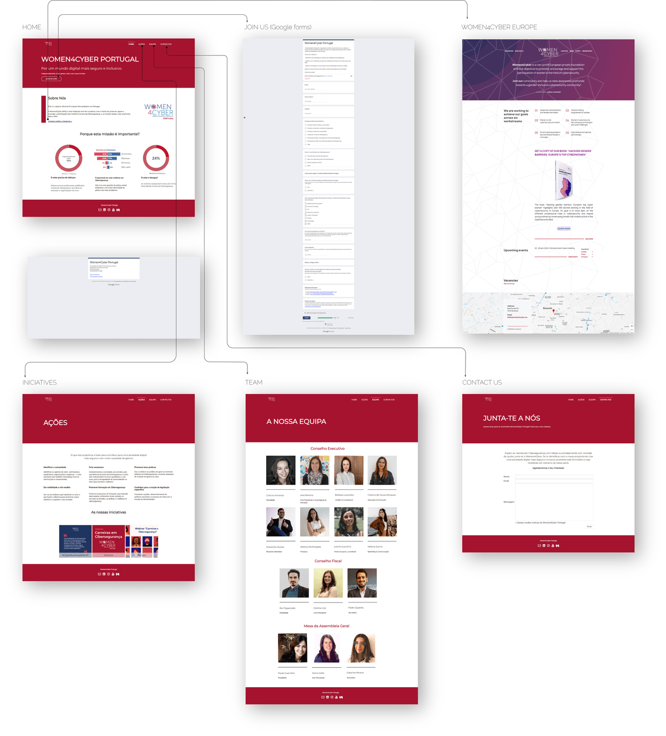
HOME
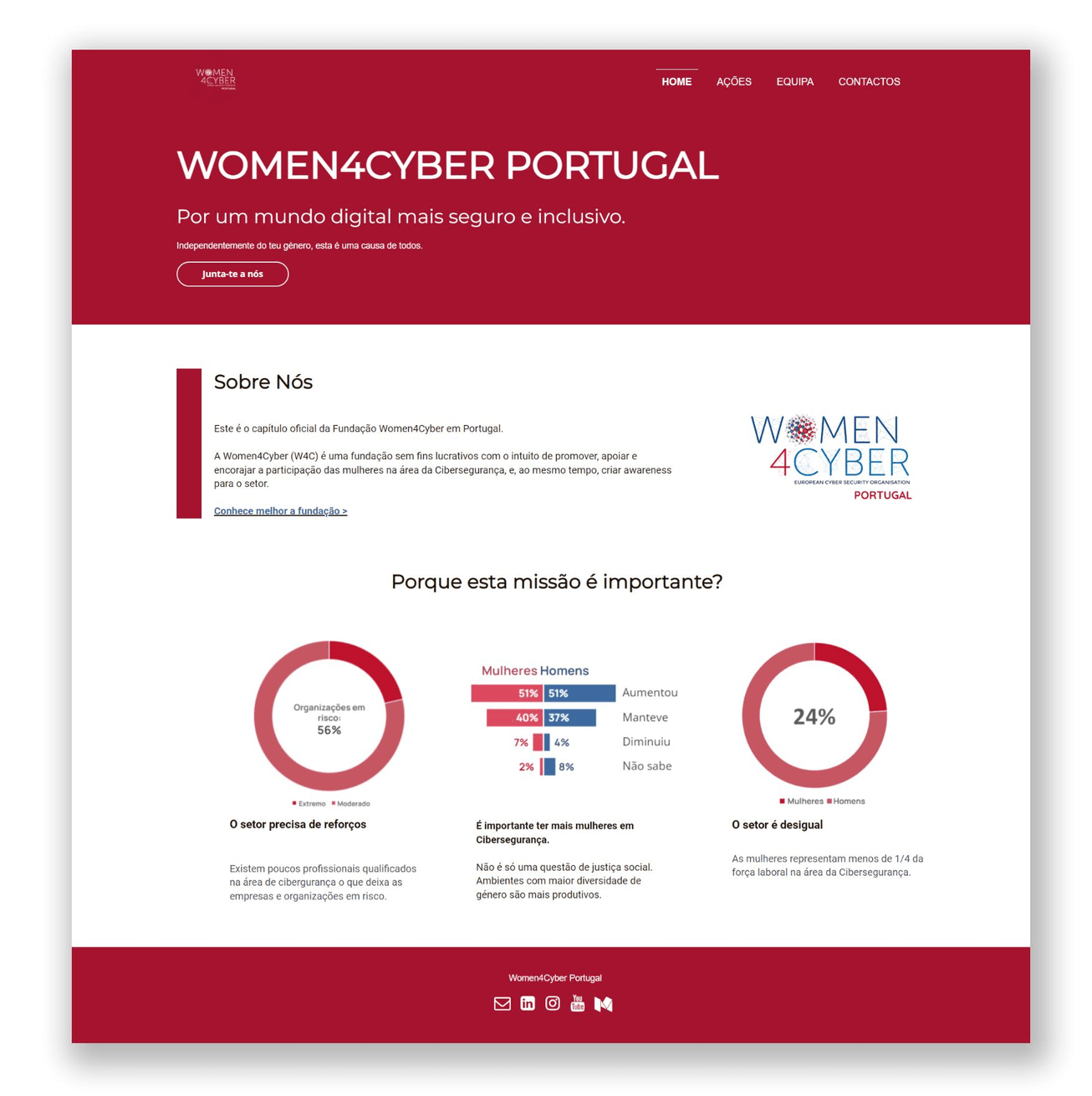
The homepage should become into a big and attractive showcase of the mission and initiatives of Woman4Cyber.
On the homepage, we see their mission explained by graphics.
- On the current website, these graphics are confusing and out of context for the users.
- They do not reinforce their message and mission.
- It is not clear that we are inside the Portuguese chapter.
Need to create a space for the membership process and the statutes and legislation of Women4Cyber.
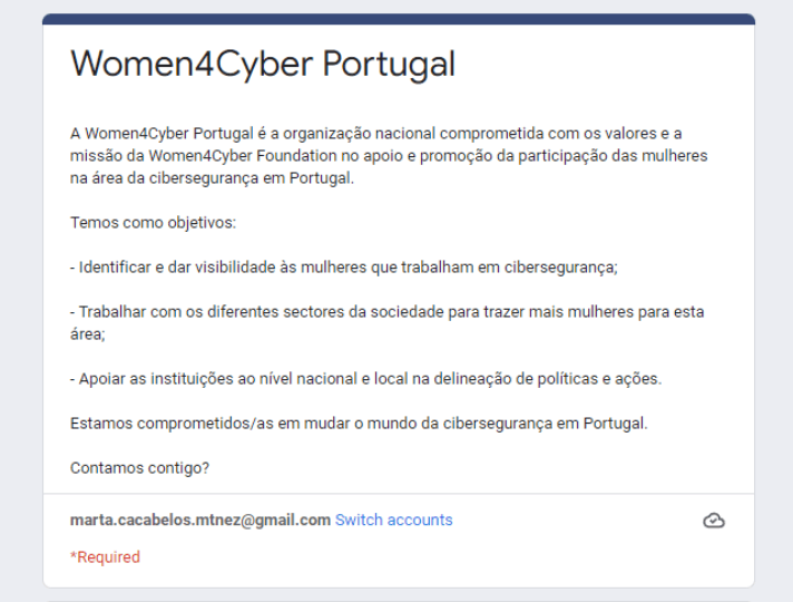
The call to action "Join us" opens a google form.
- This misleads and confuses the users. They do not know if they are asking for help or filling in an application form to join the association. It also takes them out of the context of the page.
- Once the message has been sent, there is no confirmation of correct delivery.
ACTIONS & INICIATIVES
A space on the website dedicated exclusively to all their initiatives (articles, webinars, conferences , and courses) would give them more visibility.
In the current website, the actions (solutions) appear on the same page as initiatives (events, articles…)
- Users think that the homepage should include the actions. These are their way to fight against gender inequality and lack of professionals and it would give much more power to the homepage.
- The initiatives should have a specific page for them. All kinds of activities could be included on this page.
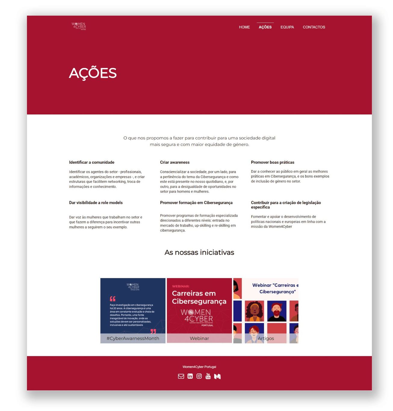
- Not having too many initiatives yet, it should be a site that grows organically. Even if the flow of content is not very wide, it should still be useful and decisive.
TEAM
A more personal presentation of the team will encourage users to get in touch.
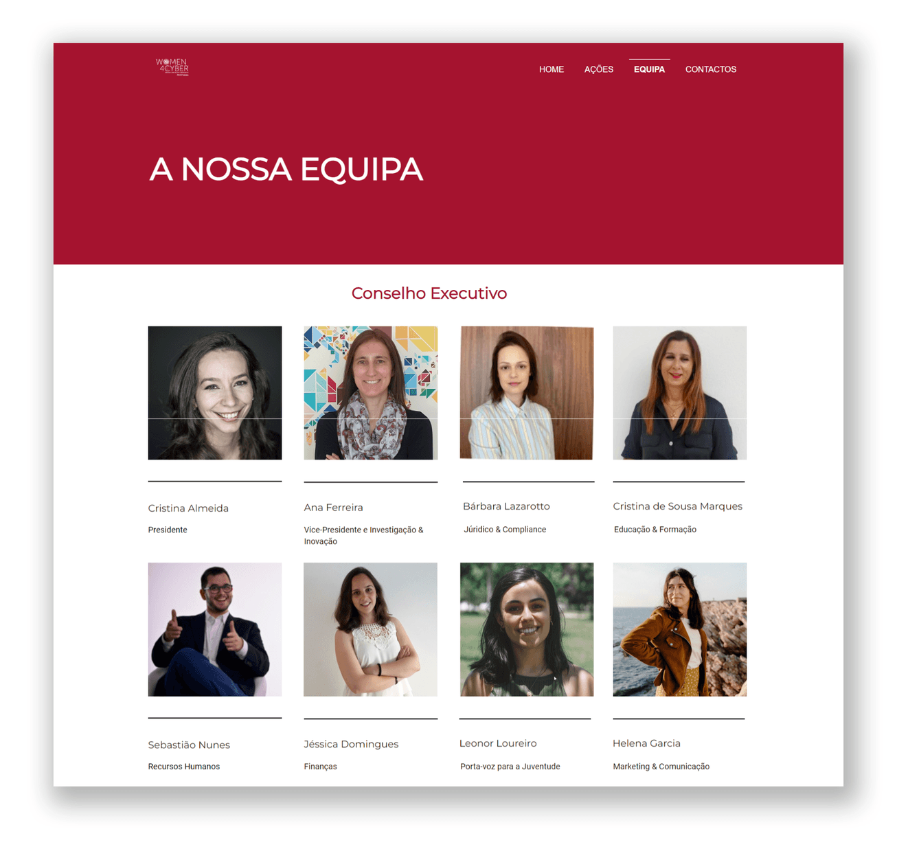
Although the team page has everything you need, it would help to introduce the members of Woman4cyber in a more personal and closer way.
Users are more inclined to make contact when they empathize and feel connected with others.
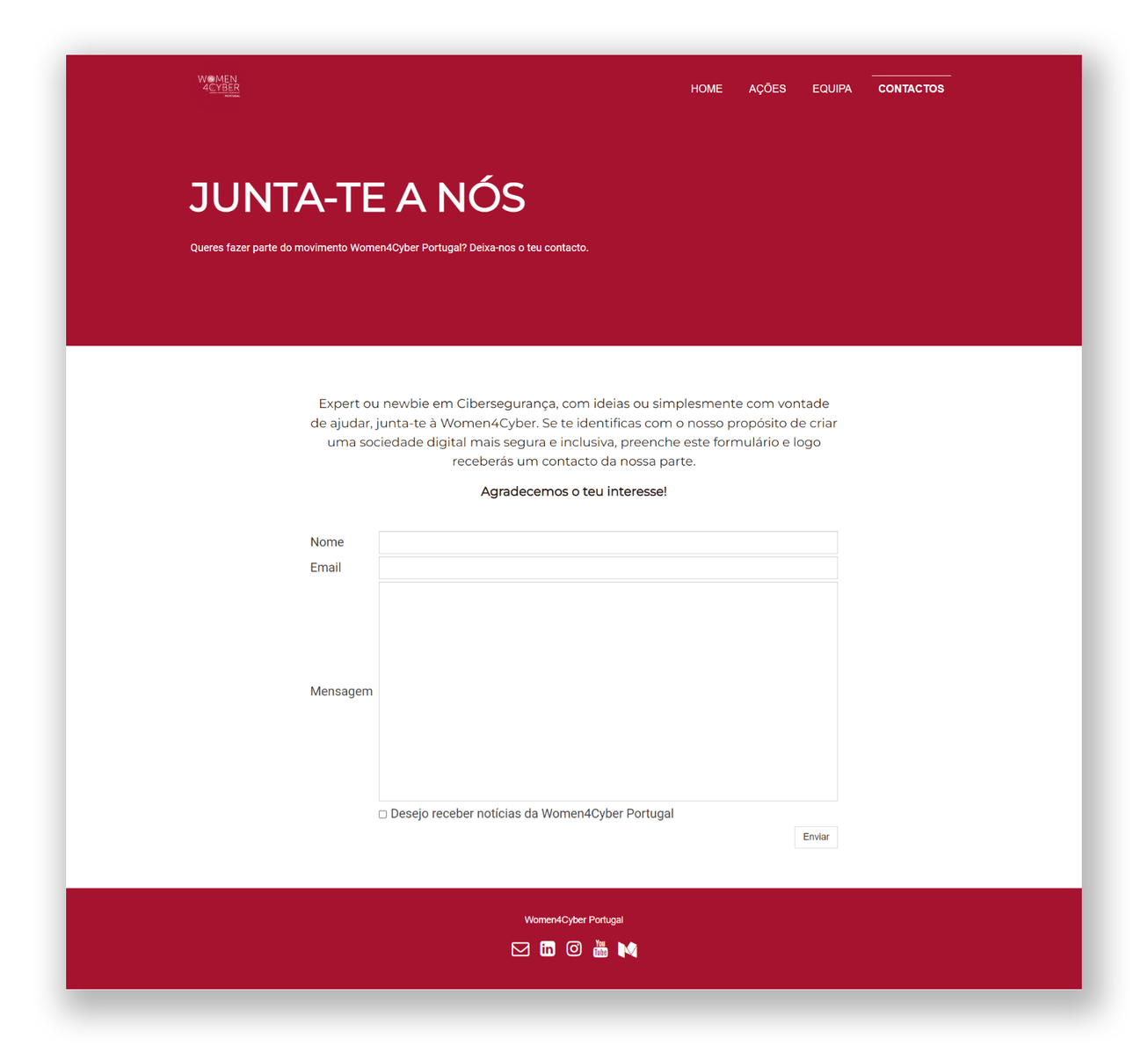
CONTACT
The contact page is quite clear.
We would attract a larger audience if we had a stronger social media presence.
✍️ Interviews and Surveys.
Our primary users were adult women who decided to change professions and young women pursuing a career in cybersecurity.
We also wanted to include teenagers to understand why girls who choose technology careers are still in the minority.
In addition to our young and adult women, we want the site to attract collaborations, partnerships, and companies. Due to time constraints, we will focus only on adult and young women. We believe that if we can generate traction among these users, this will attract other potential users as well.
Find below the number of interviews and surveys made to get to know our potential users:
10 interviews and 30 surveys of adult women
(20 to 40 years old) working in Technology and Cybersecurity.
67 surveys of teenagers
(11 to 18 years old) and 2 interviews with their teachers.
ADULT WOMEN
Concerning the adult women, we wanted to know about their professional preferences as teenagers, their journey into the field of technology and cybersecurity and what initiatives they thought would help change a career where they are still a minority.
These are some of the conclusions we drew from the surveys and interviews:
34%
worry about the gender gap in the field and have experienced discrimination in this regard.
70%
never had a role model related to the technology field.
93%
were not encouraged to pursue a technology career during their time at university.
40%
question the usefulness of the cybersecurity websites they have visited.
90%
felt insecure and unskilled when they decided to go into cybersecurity.
100%
is between 20 and 40 years old
Some of the content women miss on the sites their visit: more career content-oriented, community and networking, mentoring programs, role models, podcasts, conferences, and events.
”Hello!
I am a second-year student at a vocational school in networking and cybersecurity. I have found that to be a woman in tech, you have to find a support system. There will be challenges, and eventually, you will deal with inconsiderate people, but you have to persevere.

Strong women go into this trade. Women are stronger when supporting one another. One piece of advice I would give to anyone going into cybersecurity is to make sure you stay humble and be willing to learn for the rest of your career. You will never stop learning about cybersecurity. Focus on your goal and push for it!
It can be overwhelming. There are a lot of jobs and you have to research to find the one that aligns with the life you want to live. It is out there! You just have to push for it!
For me, there have been ups and downs to being a girl in tech. But overall, I am learning and I am loving it.”
Catarina - 2nd year cybersecurity student-
TEENAGERS
Here are some findings drawn from the surveys and the interviews with the teenagers:
Only 10% of the respondents are interested in pursuing technological careers.
5% are women
5% are men
65%
were women.
100%
are technology natives.
60%
use technology more than 2 hrs day.
80 %
are curious to learn and discover more about computers.
50%
think that they might be interested in a career in the field of technology.
79%
are familiar with cybersecurity.
Girls are more oriented towards care oriented careers.
Teenage girls drop technology-related electives from an early age. Their environment does not motivate or inspire them.
Respondents say that more practical technology tasks would help them become more interested in it.
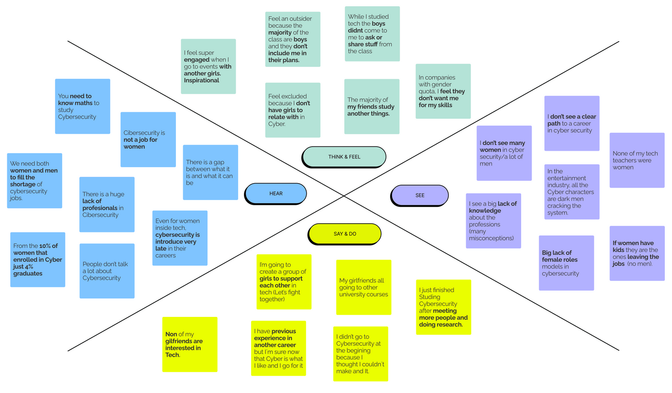
EMPATHY MAP
After the interviews and surveys, we decided that we would only focus on young and adult women. These made up the majority of our users.
We would keep our findings on teenagers in mind for future scrums, but now we had to build the foundation of our website, so we had to prioritize.
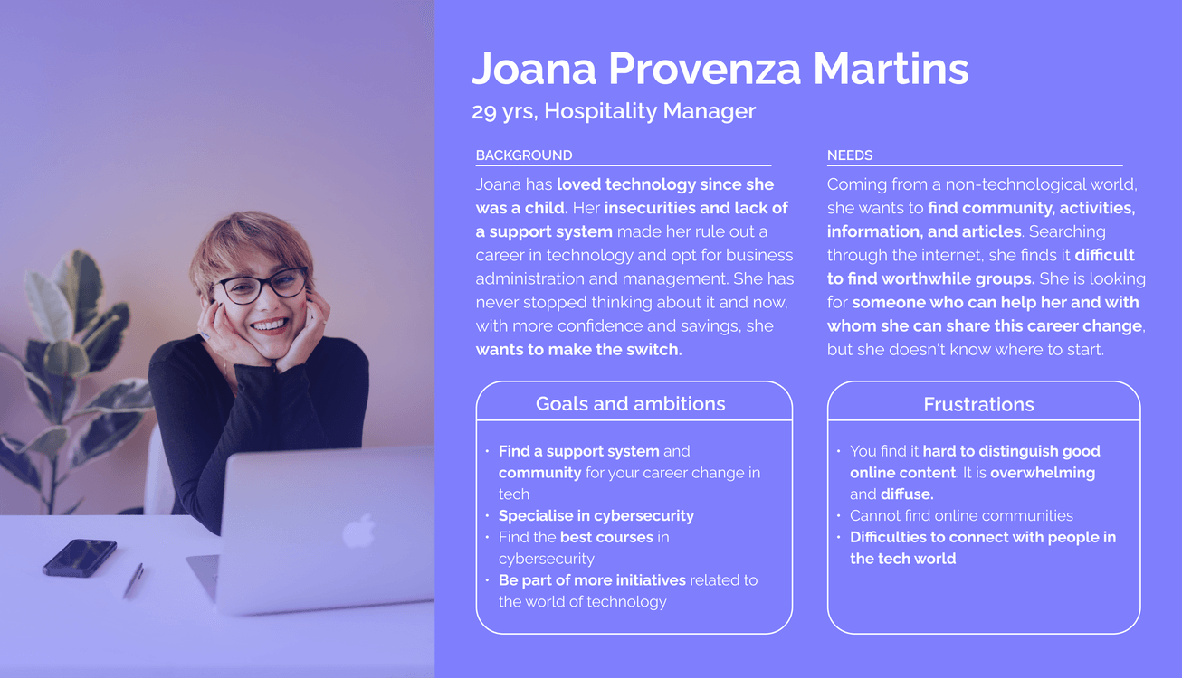
Putting together the data from the interviews and surveys we made the empathy map shown below. This helped us to connect and better understand our main users.
USER PERSONA
Our project will focus on young and adult women thinking of changing careers or specializing in cybersecurity.
We also consider adolescent boys and young and adult men as users. Given the time and scope constraints, we decided to focus on women. In this first scrum, we have to concentrate on getting the functionalities and basics of the website right. The priority goal was to reach out to cyber security-oriented women.
If we have the chase to develop the project further, I will extend the study to the rest of the potential users. I think it would be essential to consider all of them if we could develop the community or better integration of social networks.
🏅 The Competitive Analysis
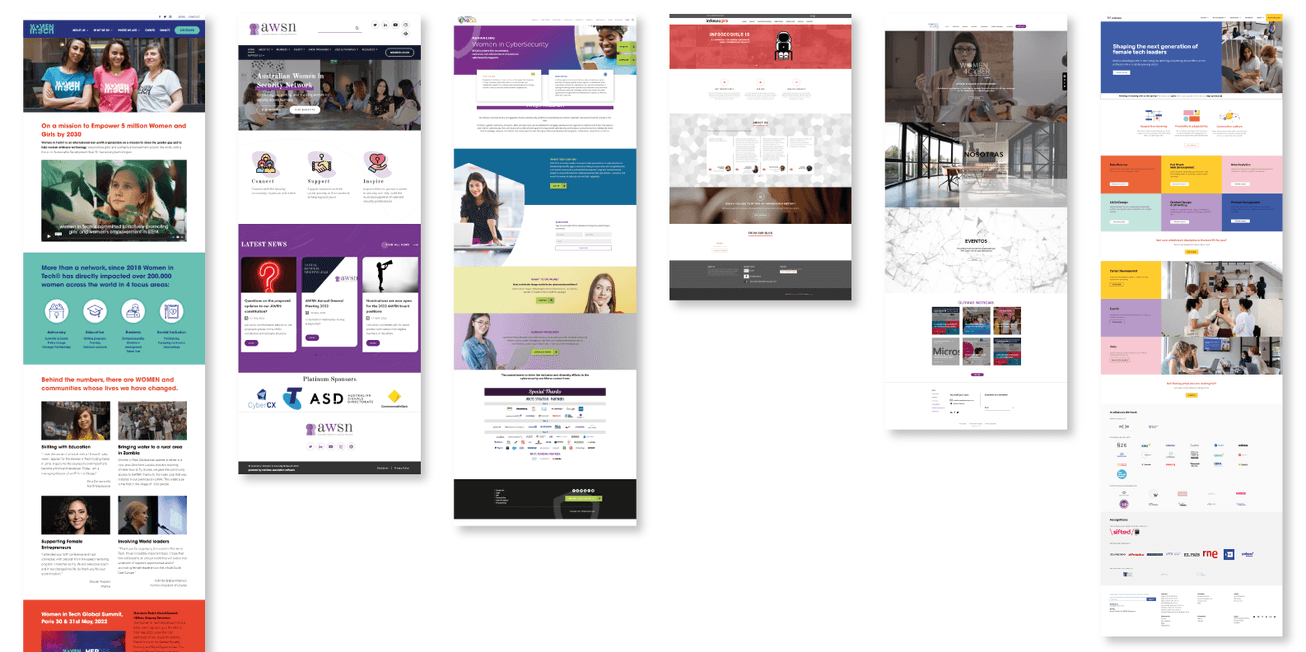
We researched Women In Cybersecurity Associations And Groups to understand better how they present themselves and what they stand for.
We were looking to collect insights that would inspire the functions, flows, and sensations that we had to evoke with the Women4Cyber Portugal website.
Click here to read about 50 of the most notable ones of the moment:
Among them, we chose five
In addition to these, we added a courses page oriented to women in tech,
Below you will find a small sample of images ordered from right to left as mentioned above.
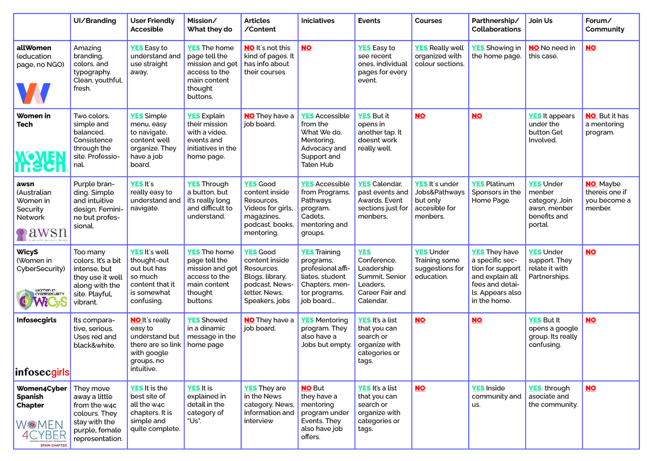
To position itself better, W4C needs a better brand.The new brand has to be related to the image of Women4Cyber Europe. It should also be unique and represent the Portuguese chapter.
All the pages analyzed have a representative brand.
It is necessary to create a page that hosts all the activities and events carried out by Woman4Cyber Portugal. Most of the websites analysed include a section for initiatives.They need a space where all their iniciatives are highlighted.
Almost all the pages analyzed are somewhat overwhelming due to the excessive amount of content. They are difficult to understand for a first-time visitor.To compete with them, we will create a page structure simpler and easier to understand.
None of the sites presented have a forum or a community. The community could give a distinction to W4C Portugal.This is something we would like to address in the next scrums, but first we need to lay the groundwork for the website.
All the sites we looked at put a lot of emphasis on their mission.It is crucial to represent the mission clearly and emphatically.
⚖️ The Moscow Method
Knowing how to prioritize was critical.
Moscow Technique helped us to see more clearly where we needed to focus. Although we would like to develop the project further, we had to be aware of the time constraints. We had to focus on the must-haves.
Click the arrow for more information about Moscow.
The MoSCoW method is most effective when it comes to prioritizing requirements in projects with either fixed or tight deadlines. It works by understanding the idea that all project requirements can be considered important but that they should be prioritized to give the biggest benefits in the fastest possible time frame.
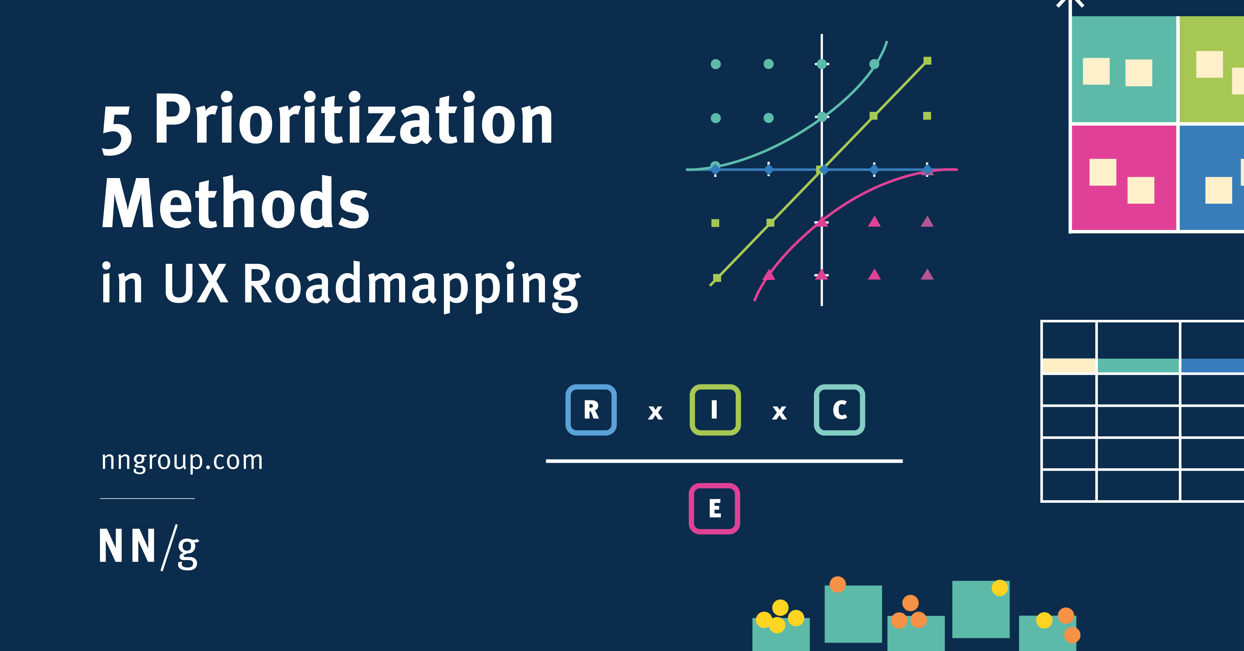
Find below NNgroup article “5 Prioritization Methods in Ux Roadmapping” which explains more extensively Moscow and other prioritization methods.
Must Have
1. A new, more youthful, and professional brand.
2. Women4Cyber’s mission.
3. Connection with the European community.
4. A page design for articles, initiatives, and events.
5. More articles on cybersecurity pathways.
6. Mention the role models campaign.
7. Numbers and graphs to illustrate the gender gap.
8. Space for partners (adding their statutes).
9. Clear distinction between “Join us” and “Contact us”
Should Have
- Internal blog instead Medium.
- Space to explain Women4Cyber actions (already exists, but may need to be rethought).
Could Have
- Website page designs for articles, initiatives, and events. Right now, a single page will display all this content, but when W4C creates more content we will redesign this page into specific ones,
- More information about the team.
Won’t Have
- A community or forum.
- Links for courses.
- Jobs.
- Podcast.
- Include articles from social media.
The Design Process
🤔 Shaping the idea
STARTING POINT
Once the research stage was over, it was time to start the design work alone.
The new website had to be a loudspeaker for Women4Cyber's mission, and the core from which the content would grow.
It had to convey the message more succinctly without overloading the user.It should be more simple, visual, and inspirational.
It should have a more youthful and professional brand to better engage with users.
SCROLLYTELLING
In search of further references, I came across the Scrollytelling.
Scrollytelling is a multimedia digital story that uses animations, audio, video, presentations, or graphs to engage the audience as they scroll down their screens, turning long stories into interactive experiences.
I thought that Scrollytelling would be an incredible tool to tell the story of the woman for cyber mission and I got to work.
As users scroll down the page, they will discover:
1. The current state of cybersecurity, 2. The role and progress of women in this field. 3. The actions taken by Women4Cyber.
This scroll will also present the different parts of the website.:Join us Who We Are Our initiatives Contact Us
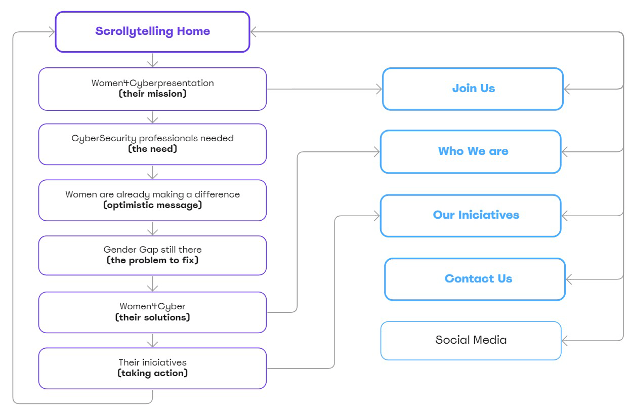
SITE MAP
The scrollytelling introduces Women4Cyber: their mission, the need for professionals, the gender gap, and the solutions they propose. At the same time, it presents the different pages (parts) of the website.
The scrollytelling works as the backbone that binds the whole website together.
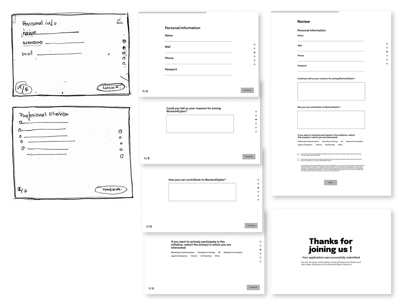
📐 Lo-Fi & Mid-Fi Prototype
Given the lack of time, I made some quick sketches for the and tested them with the users.
Mid-fi helped me to fit the designs and introduce the typographies.
After this, I just had to focus on the new branding and colors for the final prototype.
HOME
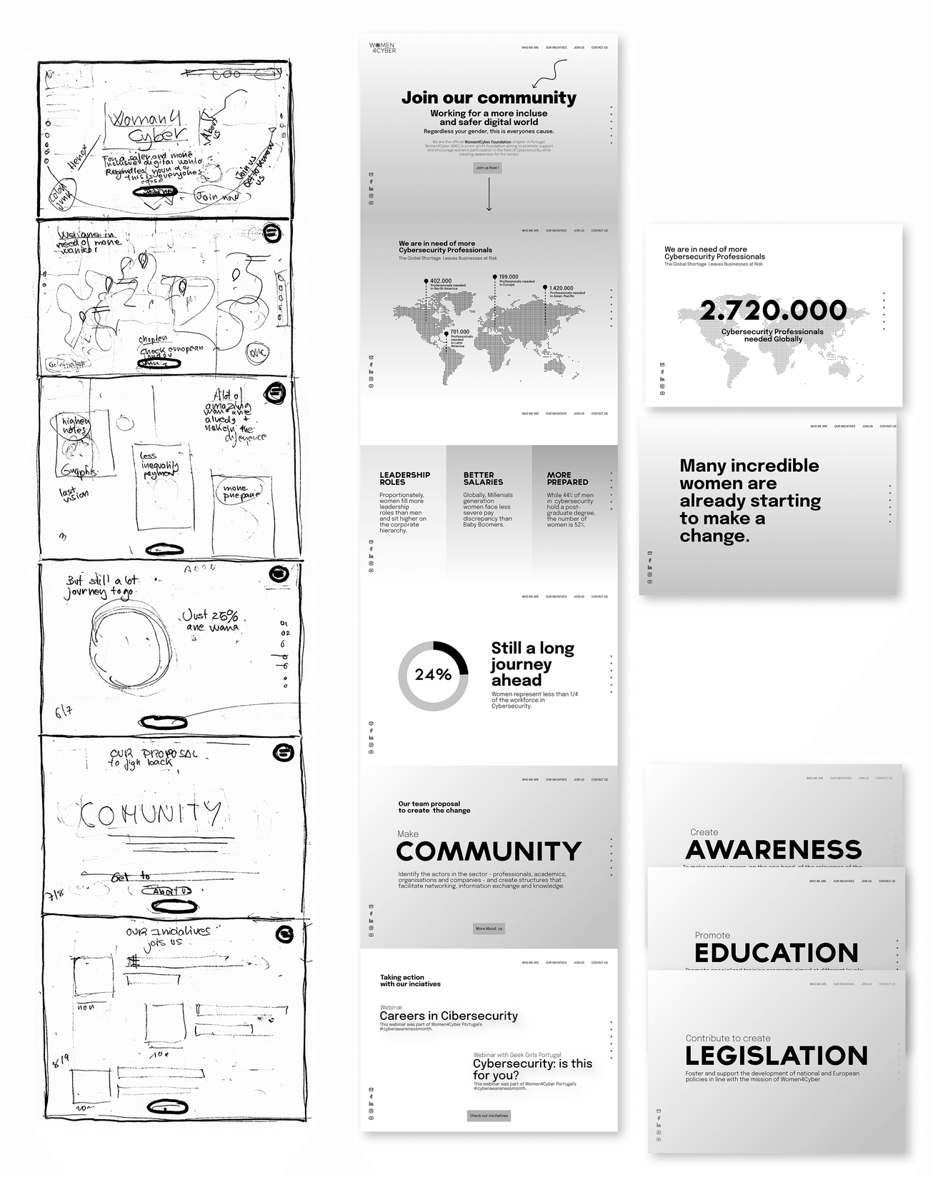
The homepage captures Women4Cyber mission in the form of a scrollable story.
The design of the animations made the Scrollytelling very dynamic and attractive.
After testing, I designed more screens to improve the understanding of the story by the users. They were surprised and engaged with this format.
This was my script to graphically develop the message that Women4cyber wants to transmit:
1. Short introduction
About then and their mission, mentioning the European organization.
2. The Problem statement
The great need for cybersecurity professionals needed globally today. We need women to fill this need.
3. Positive affirmation
Many women are already being part of the change. They are getting leadership positions, higher salaries and are better educated.
4. Call to action
But the problem remains. There are only 25% of women in the cybersecurity workforce.
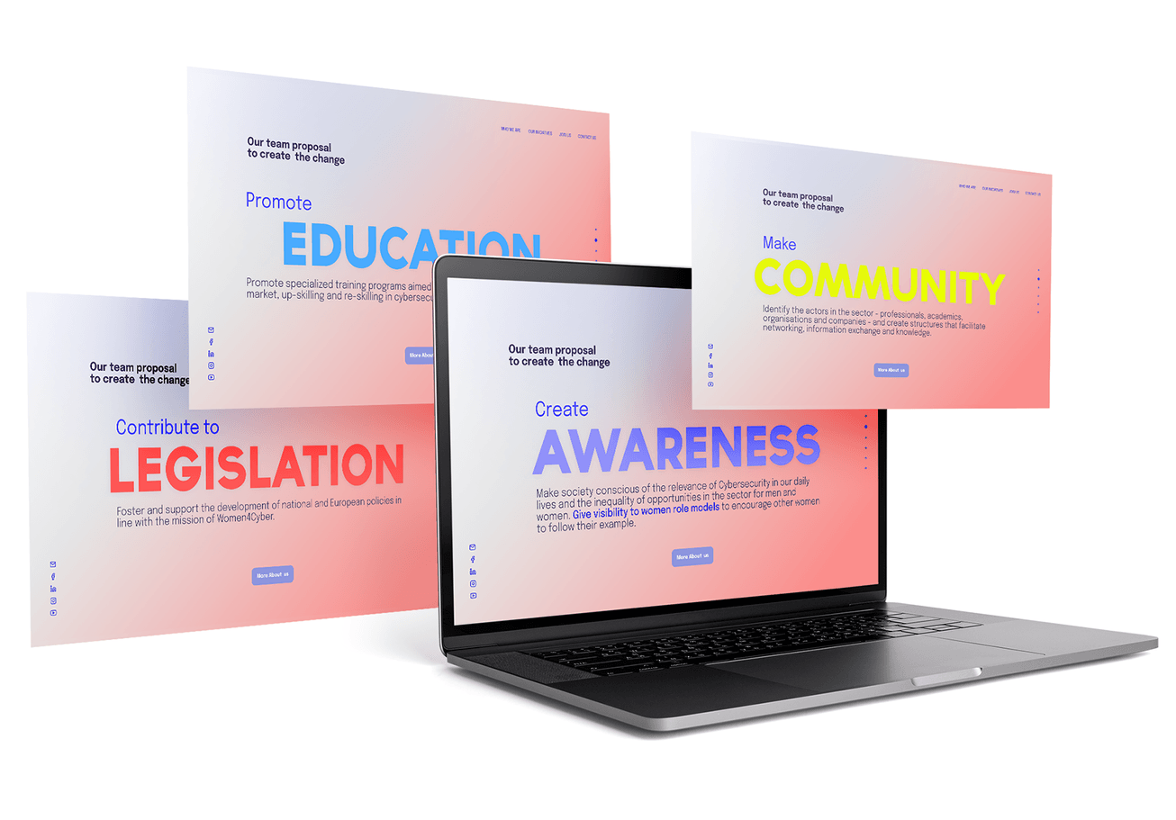
5. Women4Cyber solutions
These are the actions that W4C Portugal proposes to tackle this problem.
6. How Women4cCyber take action
These actions become real initiatives. The most current ones are presented through Scrollytelling.
INICIATIVES
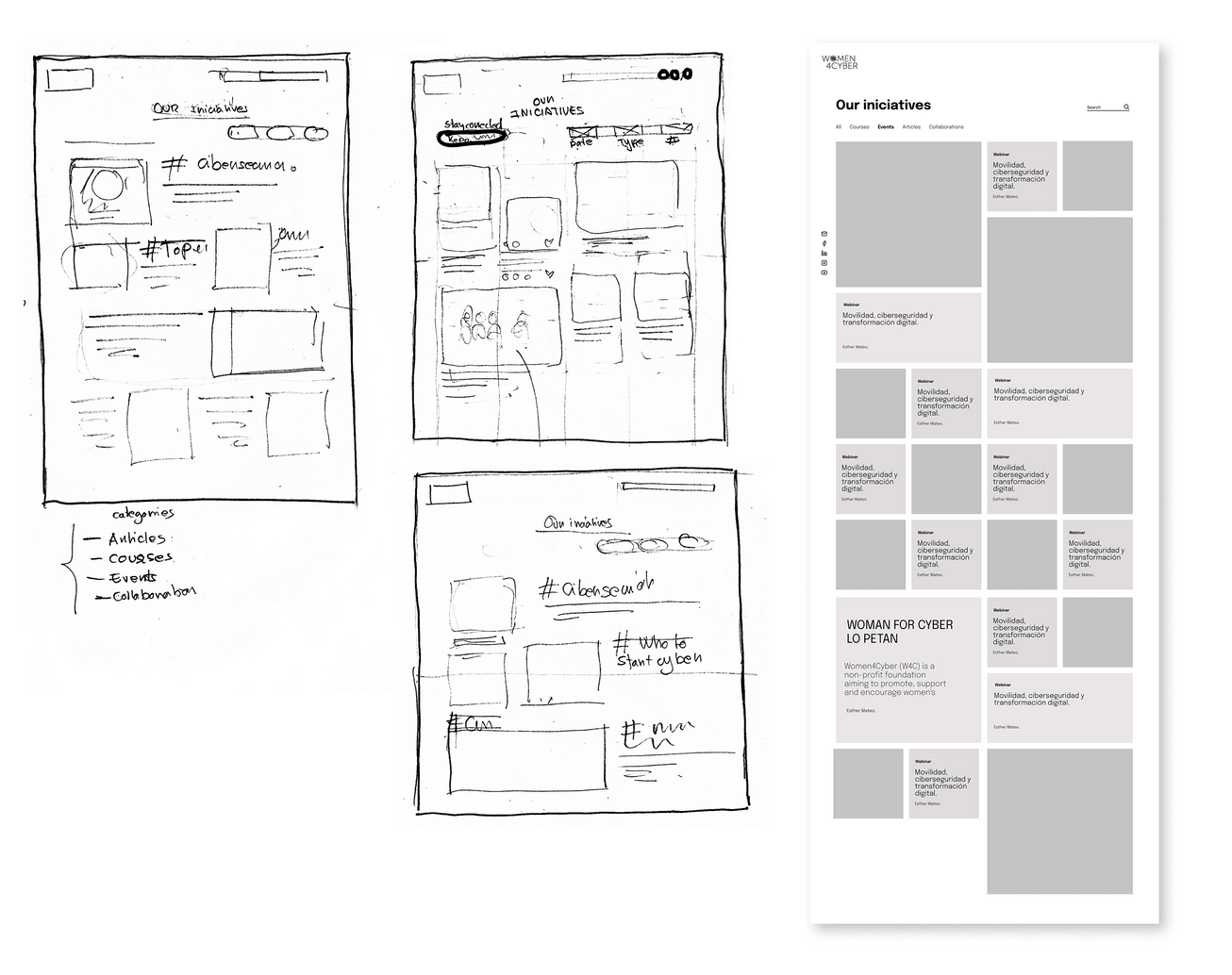
Since the foundation is relatively new and does not yet have much content.
This new page would welcome all their initiatives.
Its format allows for organic growth and supports all types of content.
TEAM
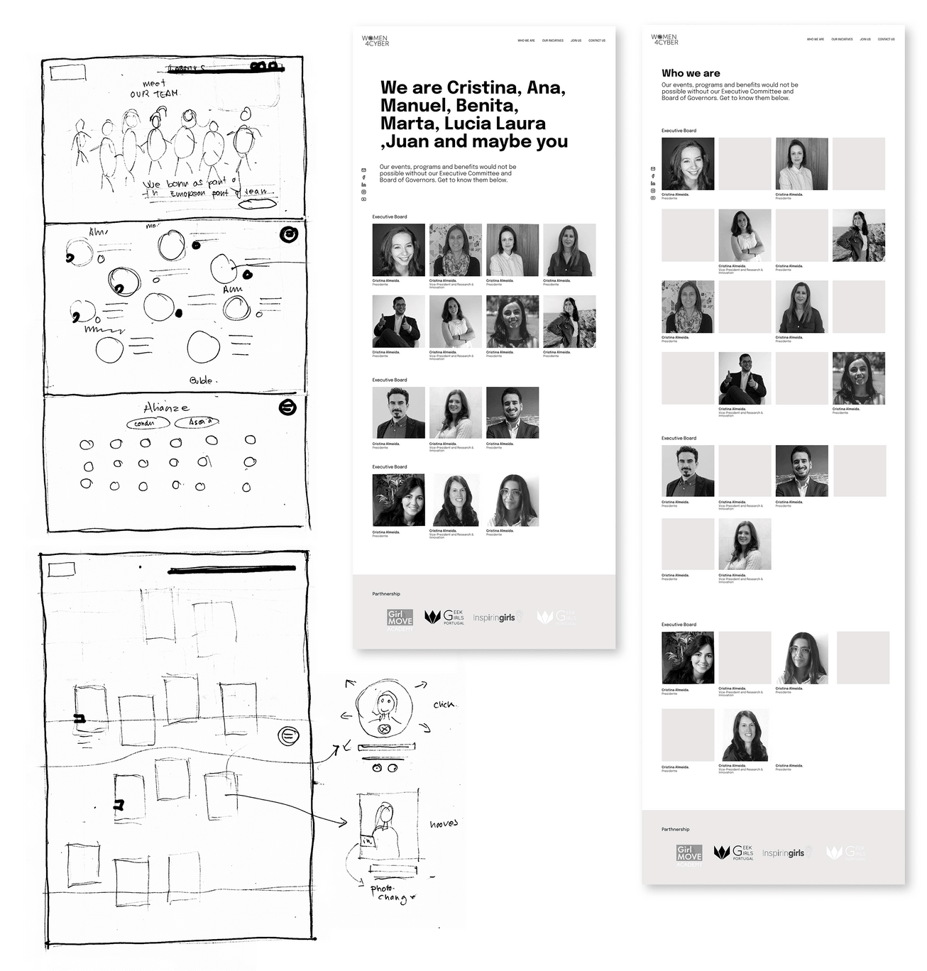
The challenge of the team page was to present them in a more friendly and casual way. I wanted to show the team social media and Linkedin, but many of them didn't have or didn't want to. I thought about a funny group or individual photos, but this was not on the scope.
Given the constraints, a casual tone presentation through text along with the images of the team was the way to give a little more friendly approach to the team page.
In both lo-fi and hi-fi I had different options. After testing it out, I decided on the simplest possible one.
CONTACT US & JOIN US
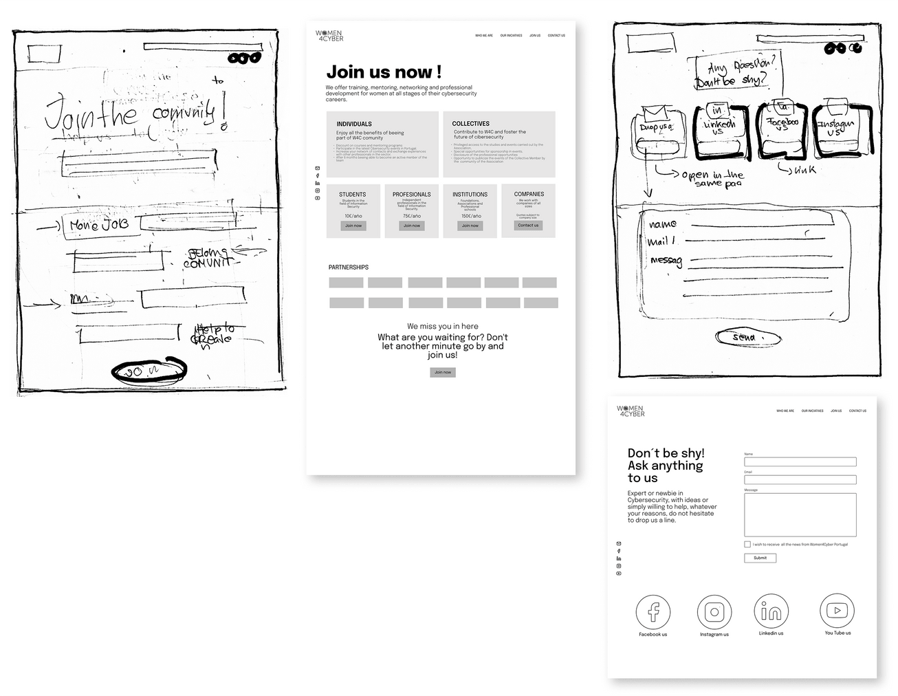
This page required a complete redesign. On the current website, if you wanted to affiliate with Women4cyber you had to log in to the contact page. This process was confusing for users.
The new "Join us" page includes details of the Woman4Cyber bylaws. Membership fees and regulations were added to the website, making the affiliation process clearer and more intuitive.
The “Contact us” page is streamlined and emphasizes social media. Anyone who wants to contact W4C should be able to do so in an accessible way.
SUSCRIPTION FORM
The subscription form (currently a google form) was redesigned and integrated into the new website.
This made the affiliation process more user-friendly and intuitive.
Final Prototype
🎨 New Branding
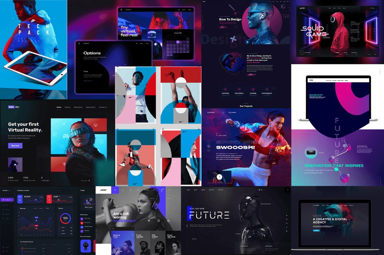
For the new brand, I look for inspiration in technological products and clothing pages that convey a modern, fresh and young touch, with color palettes that sail between the blues and reds of Woma4Cyber.
The new Women4Cyber Portugal brand aims to be more modern, minimalist, casual but professional and approachable, more in line with its users.
🌳 Functional diagram
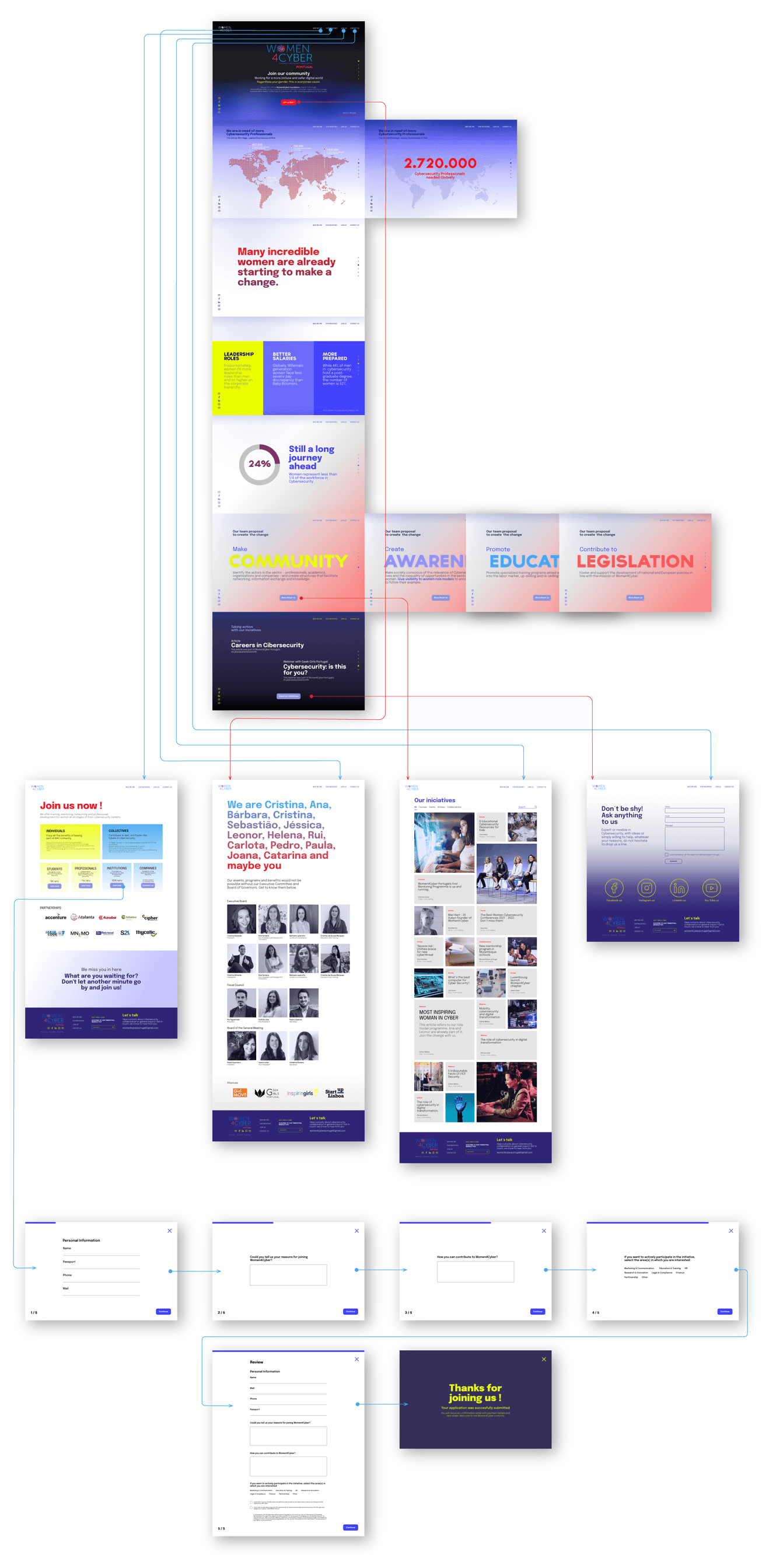
Find below a diagram of the final prototype presented:
- At the top is the home-scrollytelling with arrows indicating navigation from the menu and buttons.
- In the center are the pages Join us, About us, Initiatives, and Contact.
- At the bottom is a questionnaire to become a member of Women4Cyber, linked to the new "Join us" page.
📹 Video
Conclusions
📕 Learnings
Prioritizing is the key
With this project, I have learned the great importance of prioritizing. Time is always a limitation. We must do the best we can with it. It is essential to find the balance between what the client is looking for, what the user needs, and the time and money we have available.
Prototype testing is essential
It is essential that even if you have many constraints, you find time to test the prototype with both the client and the users. The more you do it, the better it will work.
Storytelling is a powerful tool
How you tell a story, both formally and aesthetically, has an enormous impact on the user. It is essential to know how to translate the data from your research into shaping your product.
⏭️ Next Steps
More testing and development of the website
More Prototype Testing with our clients and users would help us refine it. We would also like to add prototype pages for the articles, webinars, and initiatives included in the initiative pages.
Responsiveness
Finally, the last step would be to make the tablet and phone versions of the site fully responsive.
Building a community
In the future, creating a community within the website could help generate more conversions and reach many more users.
![Storytelling in UX Design [Beginner's Guide]](https://dpbnri2zg3lc2.cloudfront.net/en/wp-content/uploads/2021/03/power-of-storytelling-ux.jpg)
